Macy's In Store Mode
A self-service app feature that improves the store shopping experience
SUMMARY
Macy’s In Store Mode is an app feature designed to support in-store shoppers, increase sales and app engagement. I was the primary UX designer for the project, leading discovery, ideation and testing for the feature.
CHALLENGE
Macy’s store shoppers have difficulty understanding the final price of products and finding an associate to answer questions about store items. This makes it difficult to make purchase decisions, which can lead to a negative shopping experience. Store employees are tasked with a number of organizational and administrative duties and may not be readily available to support shoppers with these needs.
How might we support customers shopping in store and increase store sales?
DISCOVERY
Industry research
This project began in early 2015 when mobile use in-store was on the rise. Industry reports revealed greater use of smartphones while shopping in stores.
84%
of shoppers use their mobile devices while shopping in-store.
27%
increase in-store conversion when customers engage with digital services.
Customer research
To better understand what types of needs and behaviors while shopping in store, I partnered with our internal UX and marketing research teams.
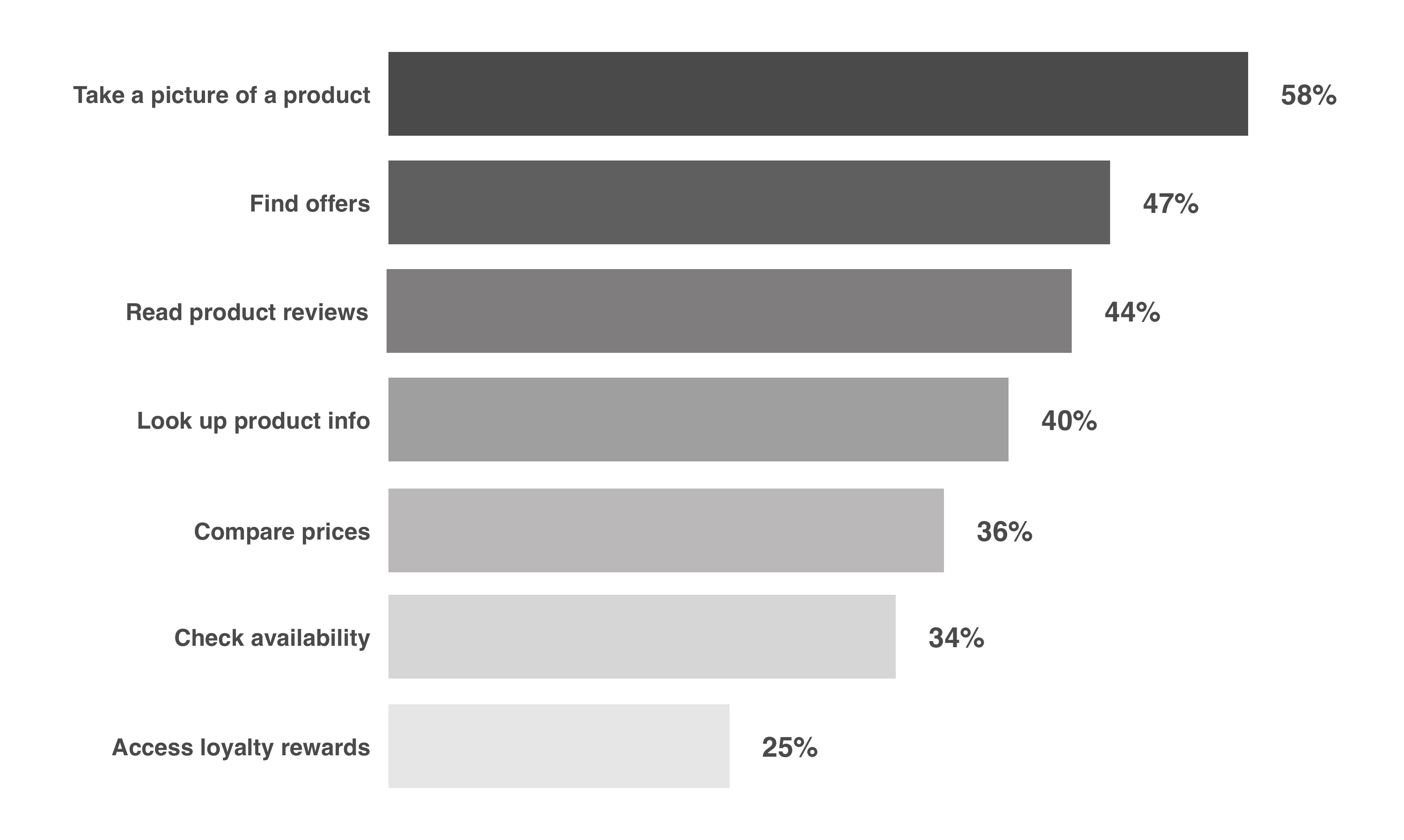
Top customer in-store pain points:
- There are few store associates available to help.
- It can be difficult to locate specific items.
- It's unclear what an item's final cost will be with promotions applied.
- It's hard to find an open checkout station and the wait can be long.
Industry research and customer surveys showed that shoppers were already using their phones while shopping in stores. How were they using their phones?
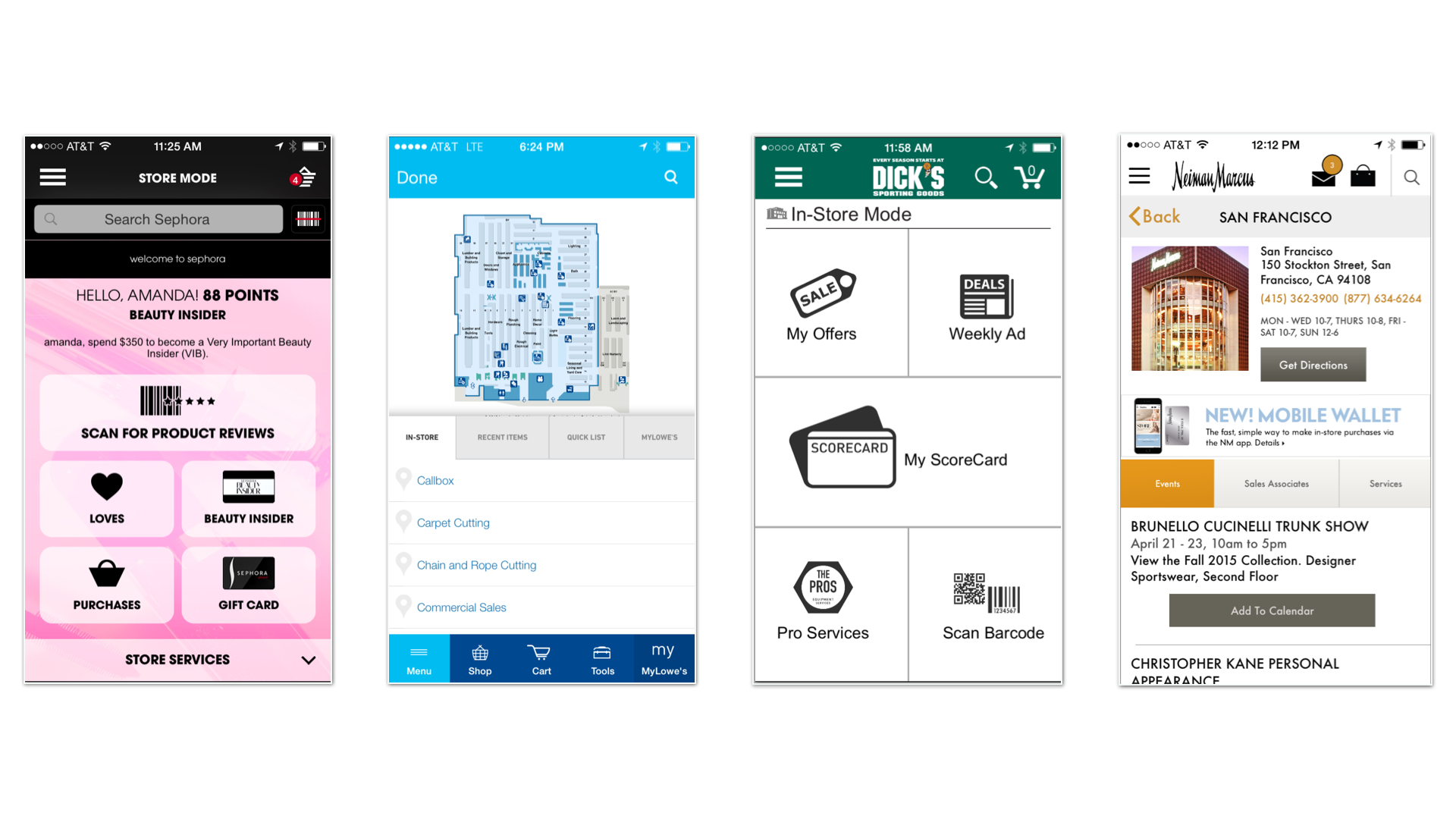
After conducting a competitive review, I found other retailers providing store tools through their mobile app to help customers get product information while they shop in store. Some apps offer in-store maps to help users with wayfinding. Apps like Sephora's and Lowe's also provided a dashboard where users can access information they might need while shopping in-store; for example, a link to a shopping list and loyalty promotions.
IDEATION
With a better understanding of customer needs and expectations, I began brainstorming the features that would be useful for our store shoppers. What information do our customers need to discover and find products? What additional information is needed to make a purchase decision? What features are already available and what would need to be developed?
Our app already had built features that could be leveraged for store shopping, but they were not presented in a single location. For example, we knew that a small percentage of app customers used the app's scan tool to check prices despite the fact that customer surveys and user testing suggested that customers found this feature useful. How can we provide easy access to all store tools and information?
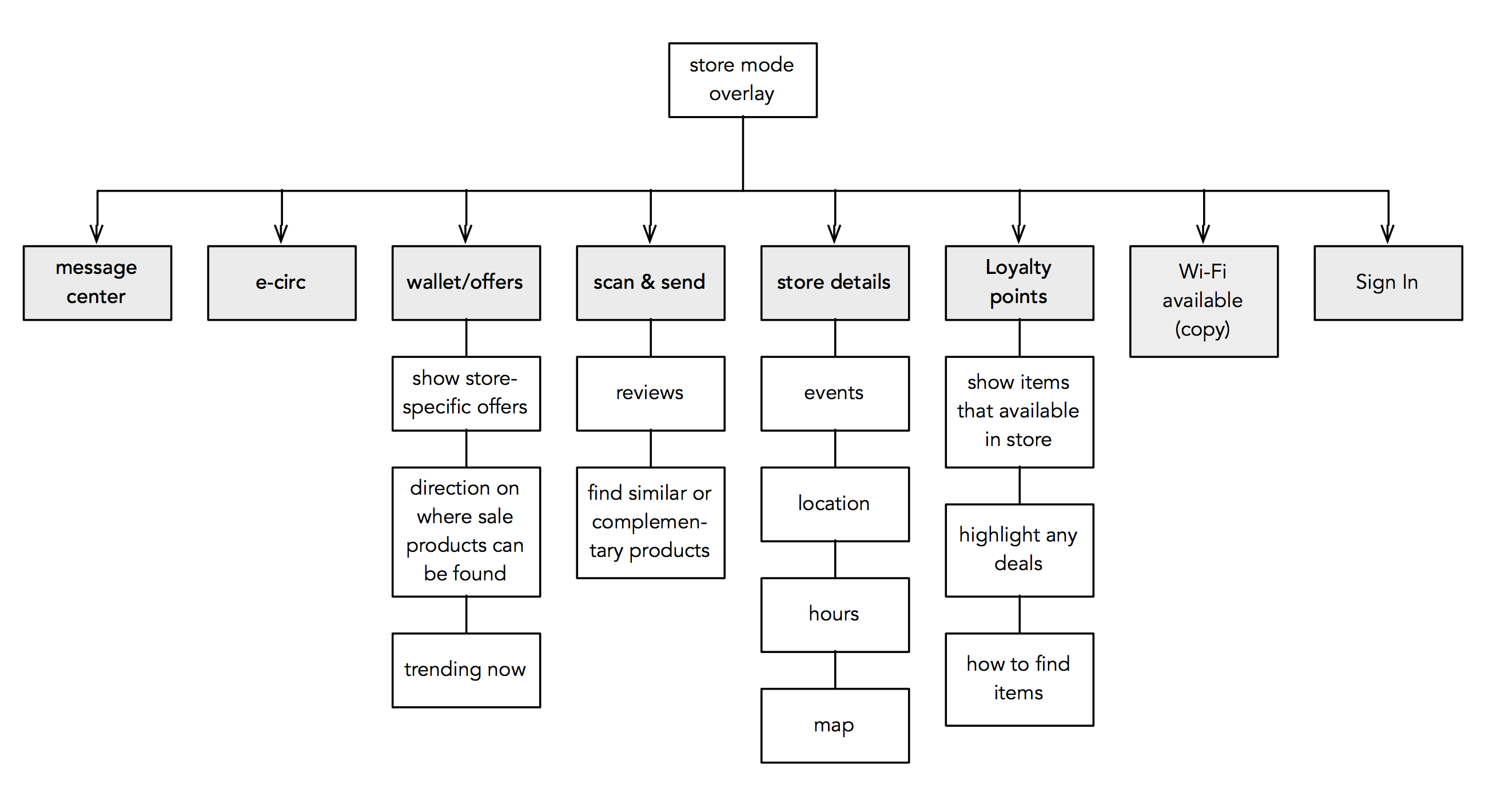
We began by exploring store hub concept -- a single page with all the necessary information and tools needed to support store shopping. This could include:
- Store details (hours, events, catalog)
- Available promotions
- Access to barcode scanner
- Summary of loyalty points redeemable at checkout
- Access of notifications (push notifications triggered by geolocation or in-store beacons)
- Registry information
Responses to earlier customer surveys helped prioritize the page information hierarchy. For example, our store shoppers are interested in learning about deals and want to understand how much they will pay for an item. Therefore, we wanted to ensure that savings passes and the barcode scanner were the primary focal targets. In contrast, customer survey data indicated less interest in store events so we deprioritized this information on the hub. The following feature map shows the content we planned to include within the hub:
Early wireframe concepts of Store Mode experimented with different content and layouts. As we continued to iterate on the design, we decided to focus on information that was most contextually relevant and present it in a way that was easy to scan while shopping in a busy department store.

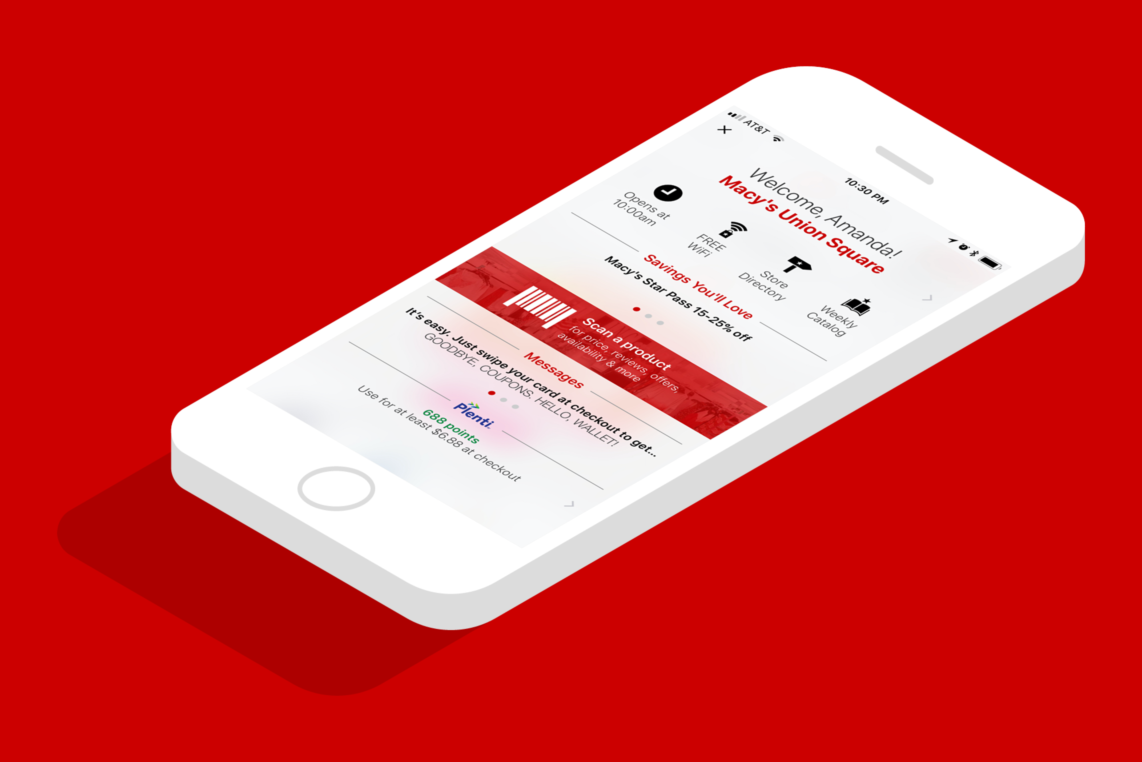
We also had to determine how users would access the feature. Since this feature would be available through a mobile app, we wanted to take advantage of mobile’s unique capabilities, such as location services. For users who opted to enable location services, we wanted to present the most relevant information to them if the app identified them in or near a Macy’s store. For this reason, we decided to update the homepage with context-specific messaging and interactions for those users located within 0.1 mile of a store.
The app homepage at the time already had store banner at the bottom of the screen. If a user opened her app while in a Macy’s store, we wanted to update the banner so that it welcomed her to the store and provided easy access to the Store Mode feature. Tapping the banner would trigger the Store Mode overlay to appear.

About half our users enabled location services, which meant we needed to ensure that our remaining users would be able to navigate to the feature. The Macy’s app used a side drawer or hamburger menu with seven top level categories: shop, offers, account, stores, registry, lists, and more. The logical place for this feature was under the stores section.
EVALUATION
After multiple iterations of design reviews, I built a click through prototype to share with the larger team and with customers. I wanted to understand if users could navigate to the feature and if content was helpful for store shopping. I also wanted to gauge how valuable users found the tool. Partnering with a UX researcher, I tested a couple different layouts:


We drafted a usability test plan and defined recruitment criteria. Remote testers answered questions and were asked to complete tasks using the prototype. Overall, findings were positive. Multiple participants had been unaware of the scan feature in the app and through this would be a useful feature for store shopping. Users were able to navigate and complete most tasks, though some had difficulty finding store details.
From app usage data, we knew that the stores section of the app had little traffic. Therefore, to ensure that all users were aware of the Store Mode feature, we decided to provide a one-time message to let shoppers know about the new feature.

I shared this feedback with product managers and creative team. We agreed on a few adjustments to the design to address some of the usability pain points.
FINAL DESIGN
The Macy’s In Store Mode feature was ultimately launched in October of 2016. Below is a quick walkthrough of the experience for a user who is identified in a Macy's store.
HINDSIGHTING & NEXT STEPS
Data indicates that the feature has contributed to greater in store purchases. Customer insight reports show that customers find the feature useful, but hard to find. Future improvements to the feature aim to improve accessibility and add more detailed store information to better support store shopping.
Not long after the feature was launched, the Macy’s app was recognized as one of the top apps in retail.