Store Maps
Designing a self-service map feature to help store shoppers navigate
SUMMARY
In 2018, I worked with a small team to investigate whether or not in-store maps might help address one of our customers' top store pain points: finding specific products in a large department store. We hoped this issue might be alleviated through self-service map tool available in the app. It might also be a way to reduce the demands on store associates. I partnered with another designer, product manager and developers to design, test and build this feature.
CHALLENGE
Leading up to this project, I worked with a small team to conduct customer research regarding the in-store shopping experience. I analyzed customer surveys and store staff feedback. To illustrate a typical experience, I created a journey map, which indicated the positive and negative aspects of the store journey. From our research, we discovered that customers often previewed Macy's inventory online, seeing what was marked as available at their local store. Then, they came to the store to try it on and purchase. Unfortunately, it could be hard to find an item in the store and often there were no store employees nearby to help, which left shoppers feeling frustrated and disappointed.
Customer Journey Map
DISCOVERY
With an understanding of our customer problem, I began to look into possible solutions. I visited stores to get a sense of what our customers and associates experienced when trying to locate specific items. I surveyed the store to see what information and tools were already available. I also reviewed competitor experiences to see how others approached this problem.
Target's Map
Some stores were arranged in a way that made it easy identify a product's location. For example, Home Depot and Target labeled aisles alphabetically or numerically and could therefore list out the item's location on the product page. In contrast, Macy's stores are organized by departments and brands. There are no aisles and each store might present a different configuration that may be updated throughout the year. In some departments there may be few store associates available to help customers find items. For these reasons, we began exploring store maps as a way to help customers find items.
Since building out models of our stores' physical layouts would be too large an effort to take on before getting a proper read of how our customers might use or value this feature, we decided to partner with a third party that could provide map support. Additionally, we decided to create a trial implementation of the feature in a handful of stores to gauge interest. Providing an in-store map would require close coordination between product development and store management teams to ensure that the information was accurate and up-to-date.
ITERATIVE DESIGN
I collaborated closely with a product manager and visual designer to brainstorm how our users might access and use store maps. To prepare for the map proof of concept, which would run for only a few months, we had to make sure we identified entry points that were logical and discoverable. Then we had to consider other opportunities for maps within the app.
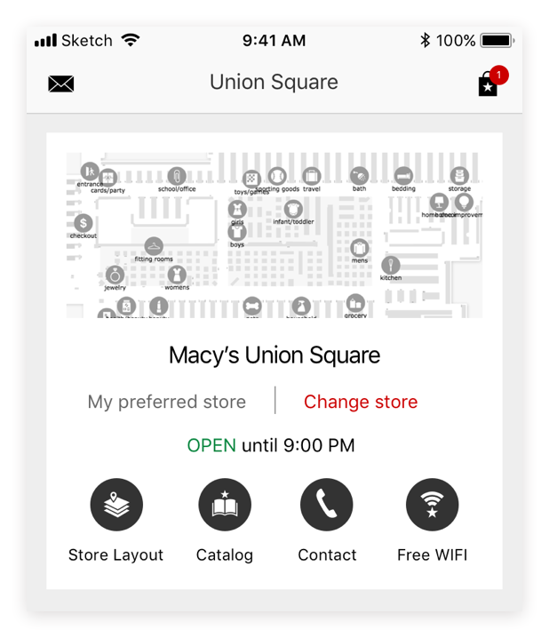
Accessing the Map
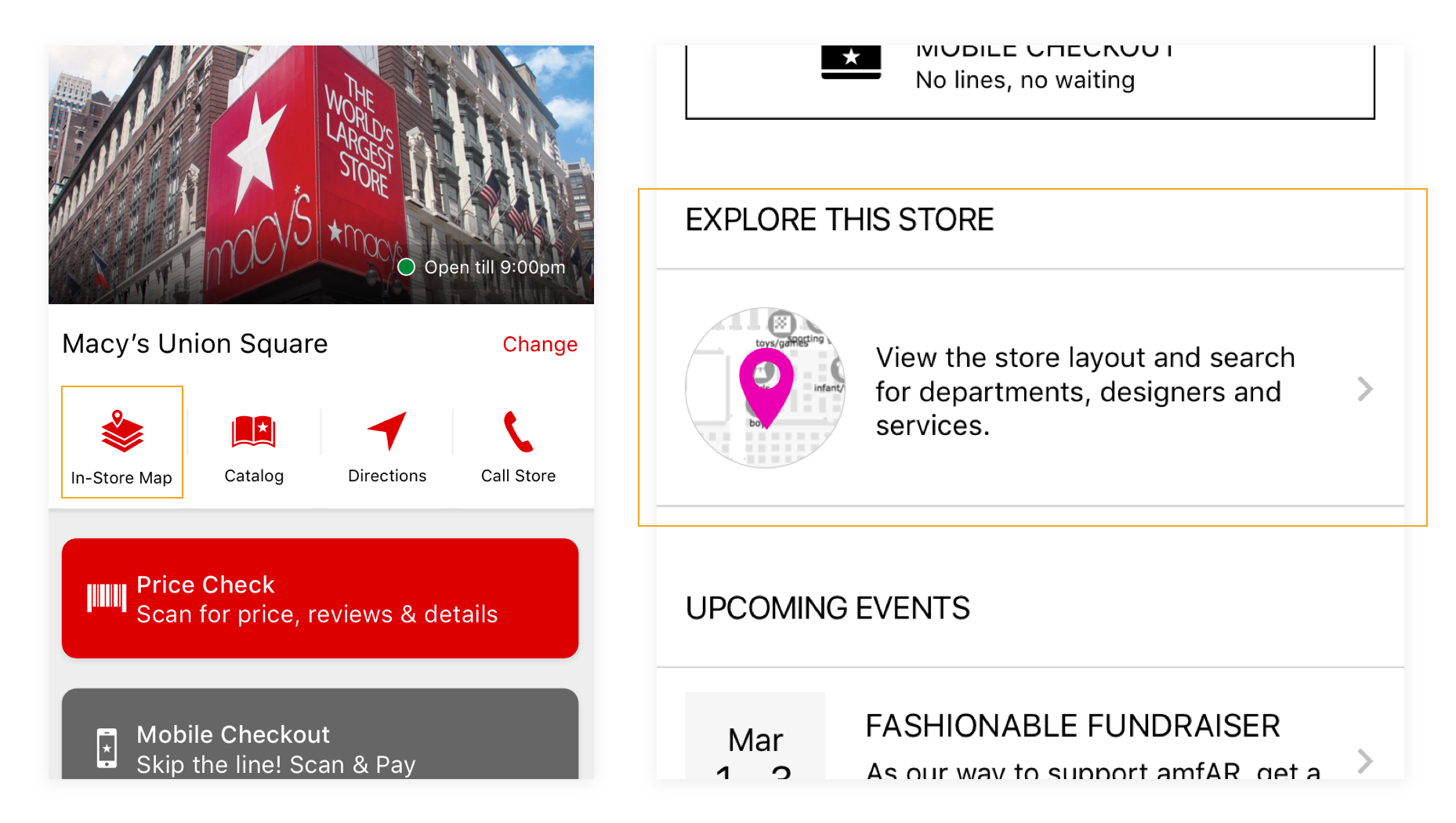
The product page seemed like the most appropriate placement as our customers already expected to find store availability messaging here. Additionally, other retailers provided store availability messaging in this same location. There was also a store hub page in the app - Macy's In-Store - that provided store details and tools for shopping in the store. This location seemed appropriate especially for users who may want to use the map to find departments or services. We also considered a user's context and whether or not it made sense ot update product grid pages with an item's location. To explore these concepts, we started with the product and store pages and generated quick prototypes to test with users.
Usage data indicated that some app users opened their apps while in store, but this still represented a small percentage of overall sessions. As a result, we explored different map link designs on the product page that we wanted to be noticeable for users who may need this information but not distracting for those who did not. At the same time, we wanted users to be aware of this information so that they could access it in the future should they need it.
In the first test, we looked at placements near the top of the screen, grouped alongside the pick up in store information and below the add to bag call to action. Each design had pros and cons. The placement at the top of the page was noticed by many users but some scrolled right past this information. When the link was located below the add to bag button, it was rarely discovered. The location near the pick up in store information was discoverable, but we had to ensure that it wouldn't be confused with the pick up selector (this is how users opt to order an item online to pick it up in store).
I then worked on a number of different design concepts that featured the link near the pick up selection:
I quickly prototyped a couple versions after reviewing with my team and worked closely with a UX researcher to prepare a rapid user test. From the test sessions, we observed that customers more easily noticed and understood the map link placement and messaging when the link was visually distinct from the pick up in store messaging. We shared the findings with the rest of the development team and made udpates to both the iOS and Android designs.
I also evaluated the map entry point on the store hub page. Since we were piloting this feature in only a handful of stores to start, we wanted a design that would work for stores that offered the feature and those that did not. Additionally, because identifying a product's location in store was an area of concern for our store shoppers, we wanted to ensure that the placement on the store hub was readily discoverable among a number of other store-related tools.
Initially, we brainstormed several concepts for the store hub design which included maps as one of the key features. One idea was to surface maps prominently on the store page when we knew the user was opening the app inside of a store. In other words, using location services to determine what content to present. When she was outside the store, a map of the store's location may display instead.
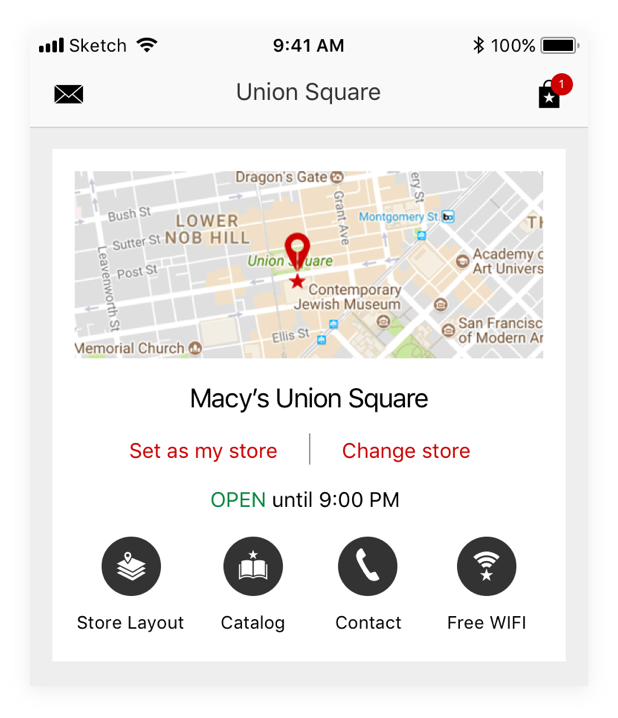
There were some technical limitations to this approach as well as the fact that a large percentage of our mobile app users did not have their location enabled. We wanted to make sure that all users could discover and access store maps. We explored an icon treatment near the top of the store page as well as a larger "module" further down the page.
We put our designs in front of users and found that they were able to discover the map when it was presented near the top of the page as a labeled icon, but some confused it for a link to the store's location using their default map app. We then tested different labels to distinguish the in-store map layout from the store's address location.
Customer feedback suggested that "In-Store Map" was the clearest label for the map feature. Once we had identified where users would access the maps and development was under way, we began exploring secondary map features.
Lists & Product Location
One feature that we thought might be valuable to our customers is the store location of list items. Customer research showed that many users research products prior to visiting the store. This includes adding items to one's wish list. Users could see which items from their wish list were available in store from the Store Mode screen. We hoped to add some additional detail to help users track down those specific items while shopping in store.
The Store Mode screen had a module with list items available in the selected store. We wanted to add more relevant store information to help customers locate these items. I worked on a couple potential concepts to review with the team and test wtih customers.
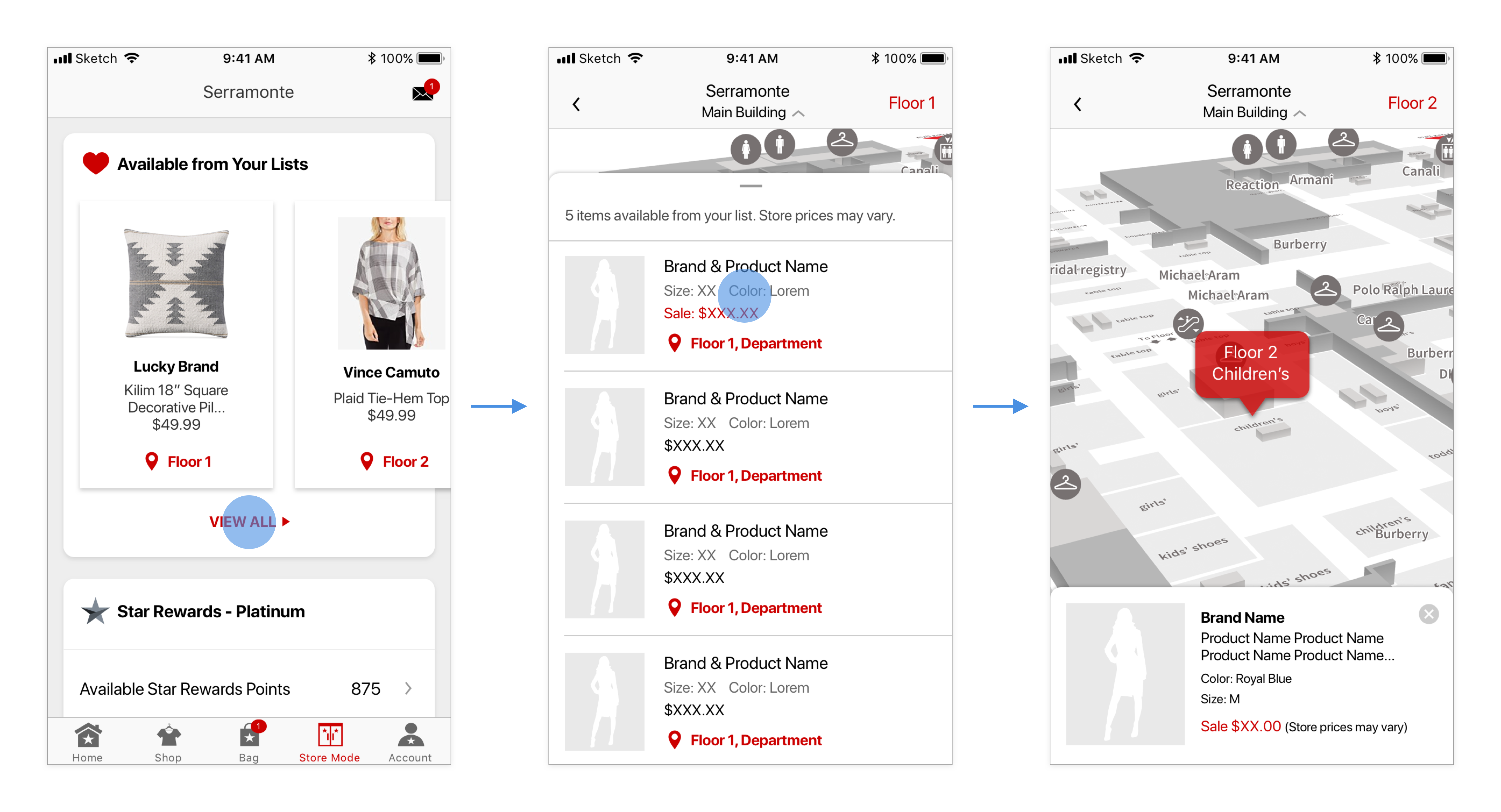
In the concept above, users navigate to a list and view individual items on the map from this overlay.
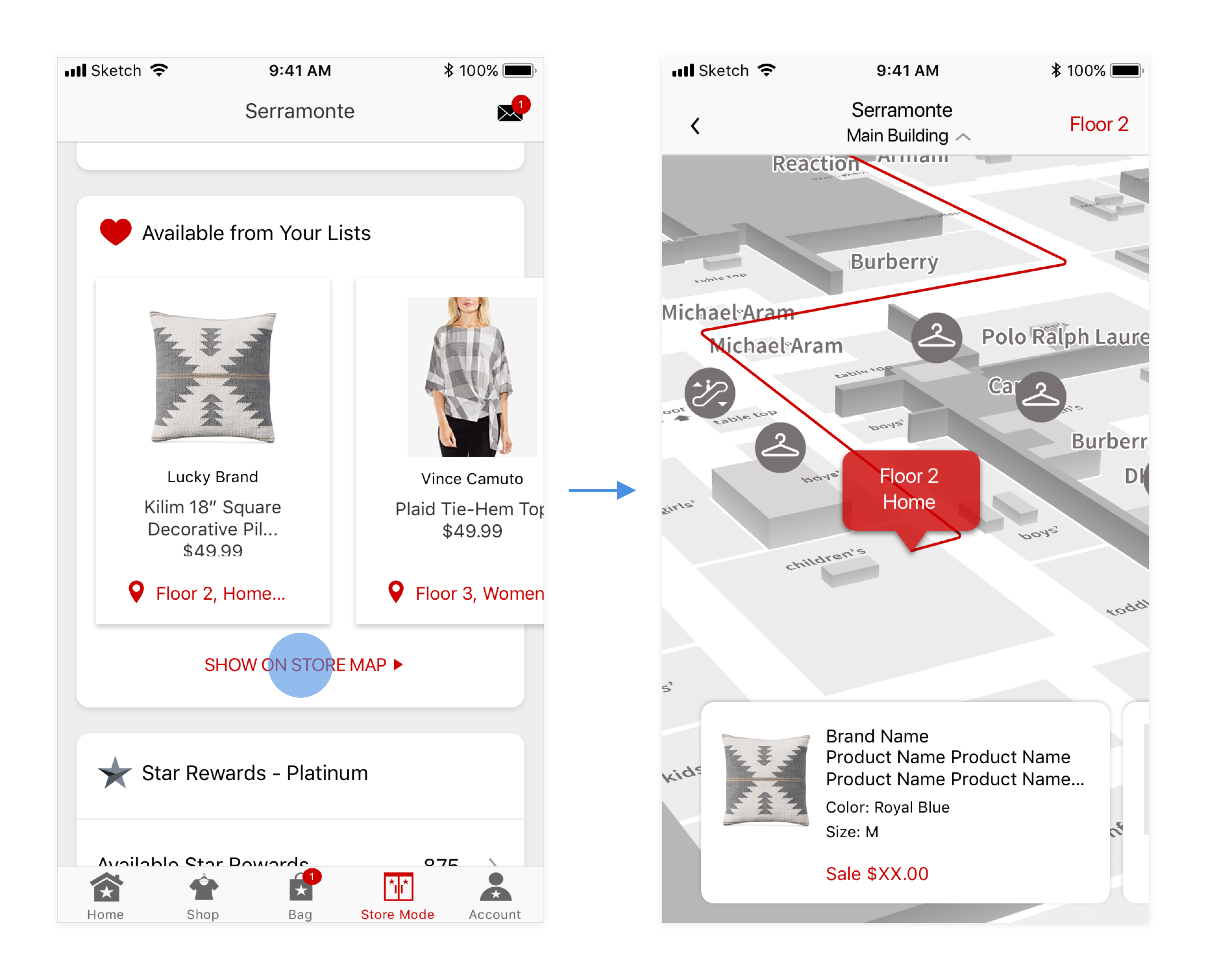
Users swipe between cards showing product locations on the map.
We decided to run some concept tests with customers to better understand whether or not routing within the store setting would be valuable. To prepare for the test, I created a prototype that allowed users to play around with the feature:
Most customers were initially intrigued by the routing concept but ultimately reported that what was provided was unnessecary. Many mentioned that they did not see themselves pulling out the app in order to get this information but to have a location of the item within the store would be valuable. As a result, we decided not to pursue routing and instead focus on providing list item location on the map.
FINAL DESIGN
In the end, we tested the map functionality across a handful of stores. We conducted some user testing with the final map feature within the store setting. On one hand, customers found the map helpful for product location. On the other, the map sometimes lacked points of reference to help users understand where they were in relation to the product's location. Most customers were familiar with Google and Apple maps and therefore had certain expectations when using a map on their phone. "Blue dot" technology may have been helpful to locate a user in store but was not technically feasible for the Macy's app at that time.
The pilot launched for a few months. Some useful usage data was gathered during this period. Then, the contract ended and the company decided to pursue other options for maps so the functionality was turned off. Maps continue to be an area of exploration and the next phase will build on what was learned here.