Personalized Homepage
Improving customer engagement with dynamic & relevant content
SUMMARY
I worked with a small team to conduct a variety multivariate tests to learn how we could improve the Macy's app homeapge by making it more relevant and dynamic for our mobile shoppers. Our customers were also having difficulty browsing Macy's large inventory for products that met their interests and needs. As the lead UX, I collaborated with a small team to test different, more tailored homepage concepts.
CHALLENGE
Our team faced a few challenges in designing and building a more engaging homepage. The existing code for the page was inflexible and needed to be refactored to support experimentation. Although we had many ideas for possible content on the page, there were a few dependencies that constrained the early testing efforts.
DISCOVERY
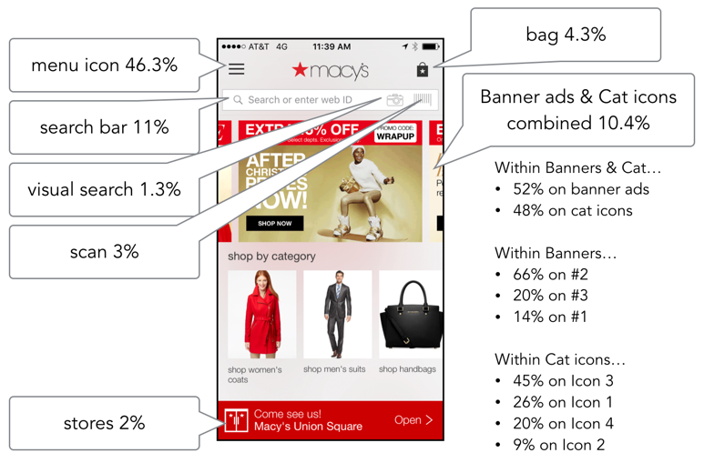
To start, I wanted to understand current customer behavior. At the time of this project, the only way users could access the app was through the homepage. Therefore, it was important to understand what our customers were doing once they arrived on this initial page. Were there aspects of the existing design that could suggest what content users valued most on this page? I leveraged click through data for the page and found that most customers bypassed the prominent content on the page (marketing banners and categories) and went straight to the menu or search bar.
I also conducted competitive research to see what content competitors used on the homepage and any evidence of personalization. Many competitors did not seem to offer much personalized information, but those who did appeared to leverage a customer's shopping history in order to surface related products on the homepage. Some competitors are also promoted local store events and information if they recognized your nearest store or collected store preference.
Nordstrom's Personalized Homepage:
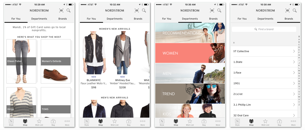
Personalized content in the "For You" tab reflects a user's shopping history.
Amazon's Personalized Homepage:
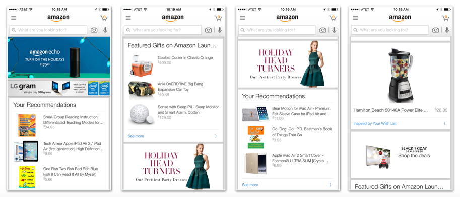
Amazon offered an "endless" page of product recommendations based on shopping.
JC Penney, Target & Zappos "One Size Fits All" Homepages:
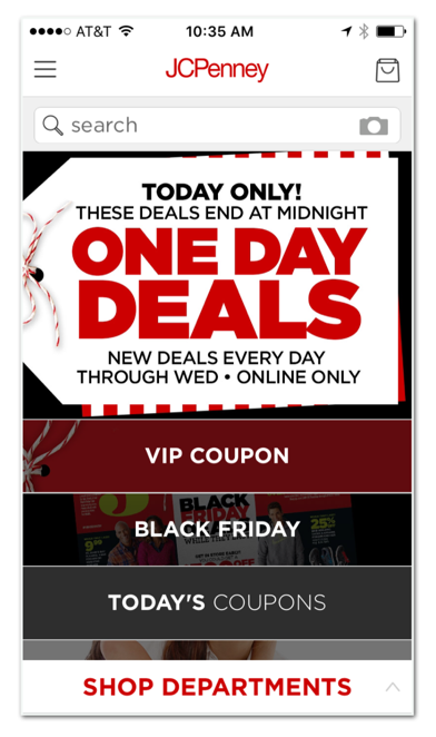
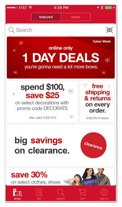
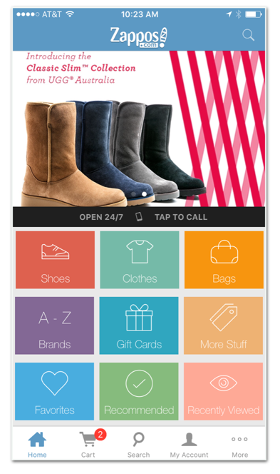
Other competitor pages had little evidence of personalization on their homepages.
IDEATION
I worked with a visual designer and product manager to begin brainstorming different designs for the new homepage. We knew we would have an opportunity to run multivariate experiments to help us learn which content is most engaging for our app users.
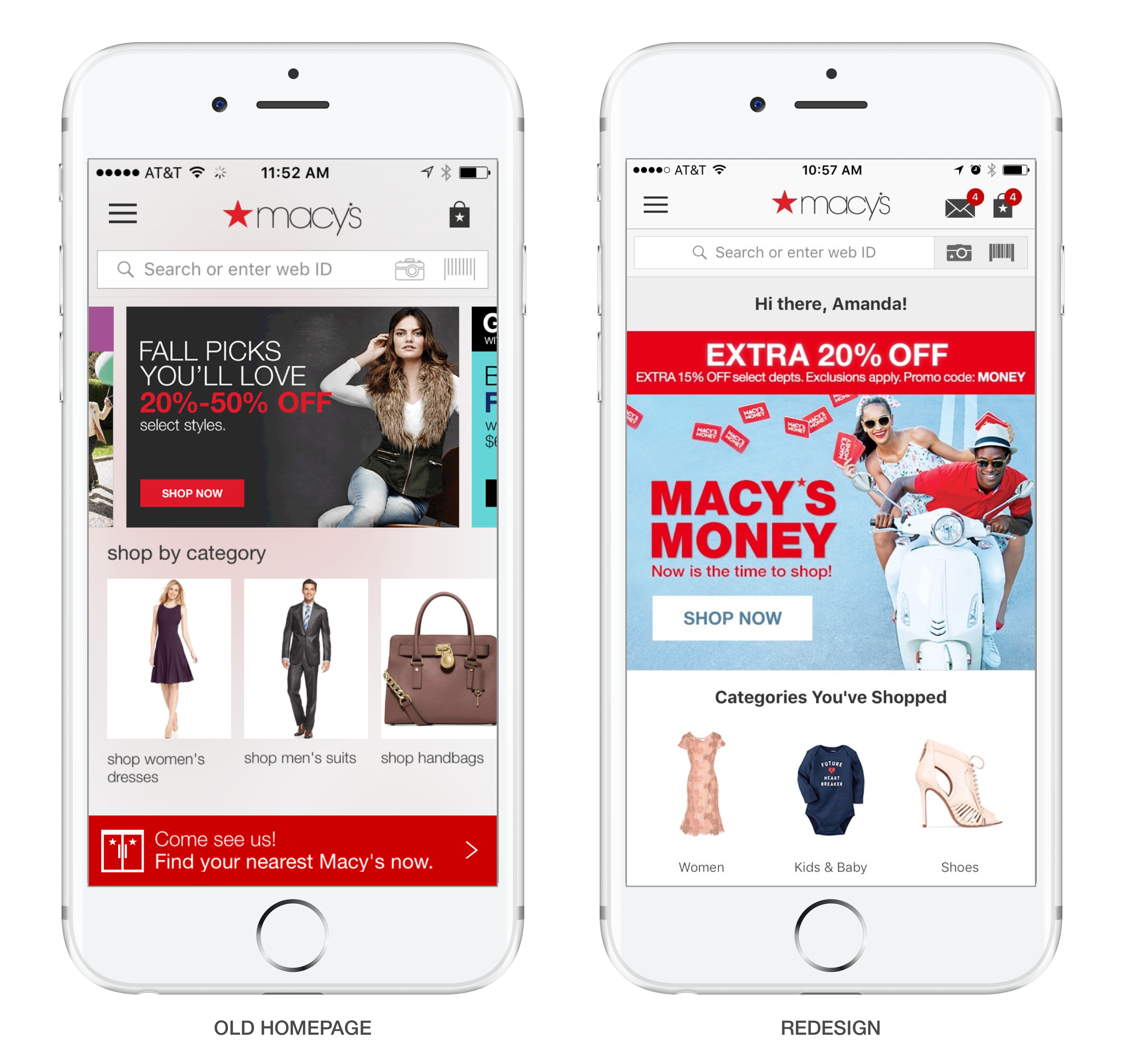
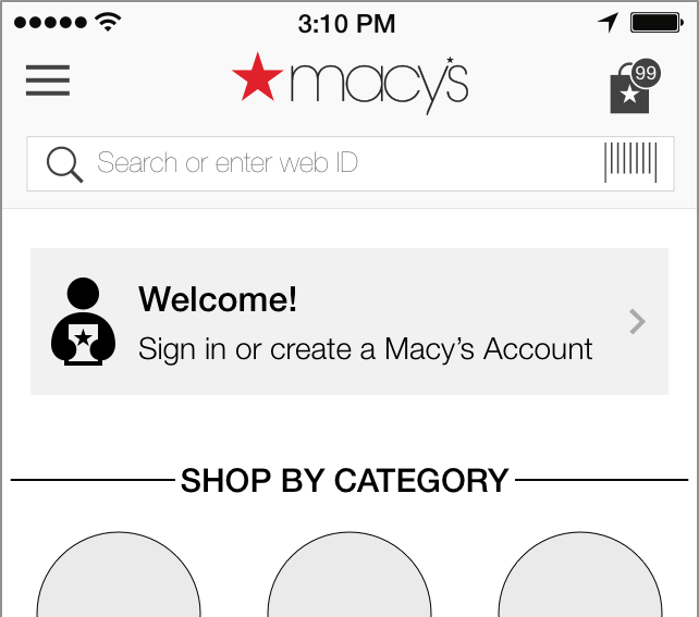
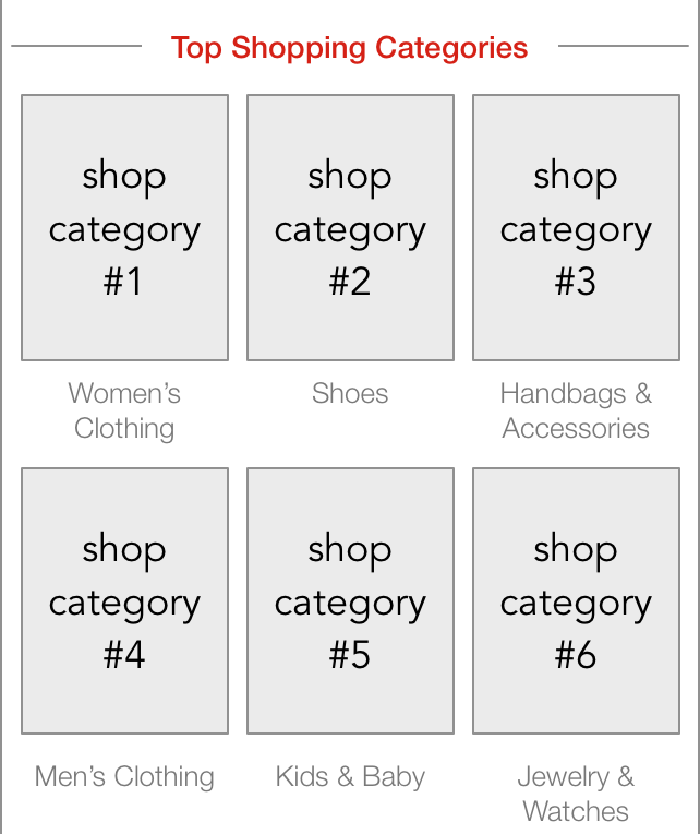
The existing homepage content was limited and static. It contained a few modules and on screen that did not scroll. Below the header, there were a few marketing banners in a carousel. And although Macy's offered over 10 shopping categories, only 4 were displayed on the homepage. All users saw the same marketing ads and shopping cateogories. There was also a store banner that appeared at the bottom of the screen. If the user's location was known, a link to the nearest store's details appeared. Otherwise, there was a more generic messaging to find a store nearby.
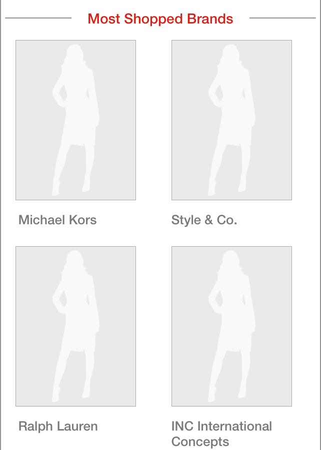
We wanted to provide more dynamic content and help our customers navigate to products that matched their interests. For repeat users, we could leverage their prior browse and purchase history to surface up product recommendations. Additionally, we wanted to introduce more inspirational content that might help customers learn about new products and brands.
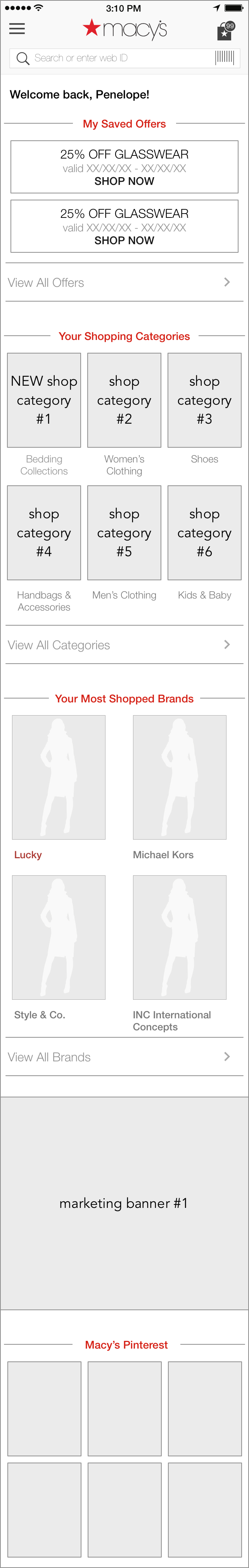
Early wireframe concepts for known shoppers prioritized valued content (i.e. sales, offers and categories) and displayed more personalized shopping recommendations based on a user's history:
New users might see a similar layout but content would be based on top selling items on the site. There would also be prompts to sign in since most app users have login credentials.
EVALUATION
My team had conducted a small A/B test using the existing homepage to test a longer version with product recommendations. From this test, we learned that users will scroll and engage with information presented beneath the fold. I developed concepts for content types on the homepage but wanted to understand which modules would be the most engaging and what order best serves customers when they land on the homepage. I also had to coordinate with marketing partners since they developed sales banners and other content on this page.
The goal was to run multivariate experiments to determine which types of content resulted in greater engagement with product: product page views and add to bag conversion rates. Additionally, we were interested in learning how The following chart displays the various modules and layouts tested:
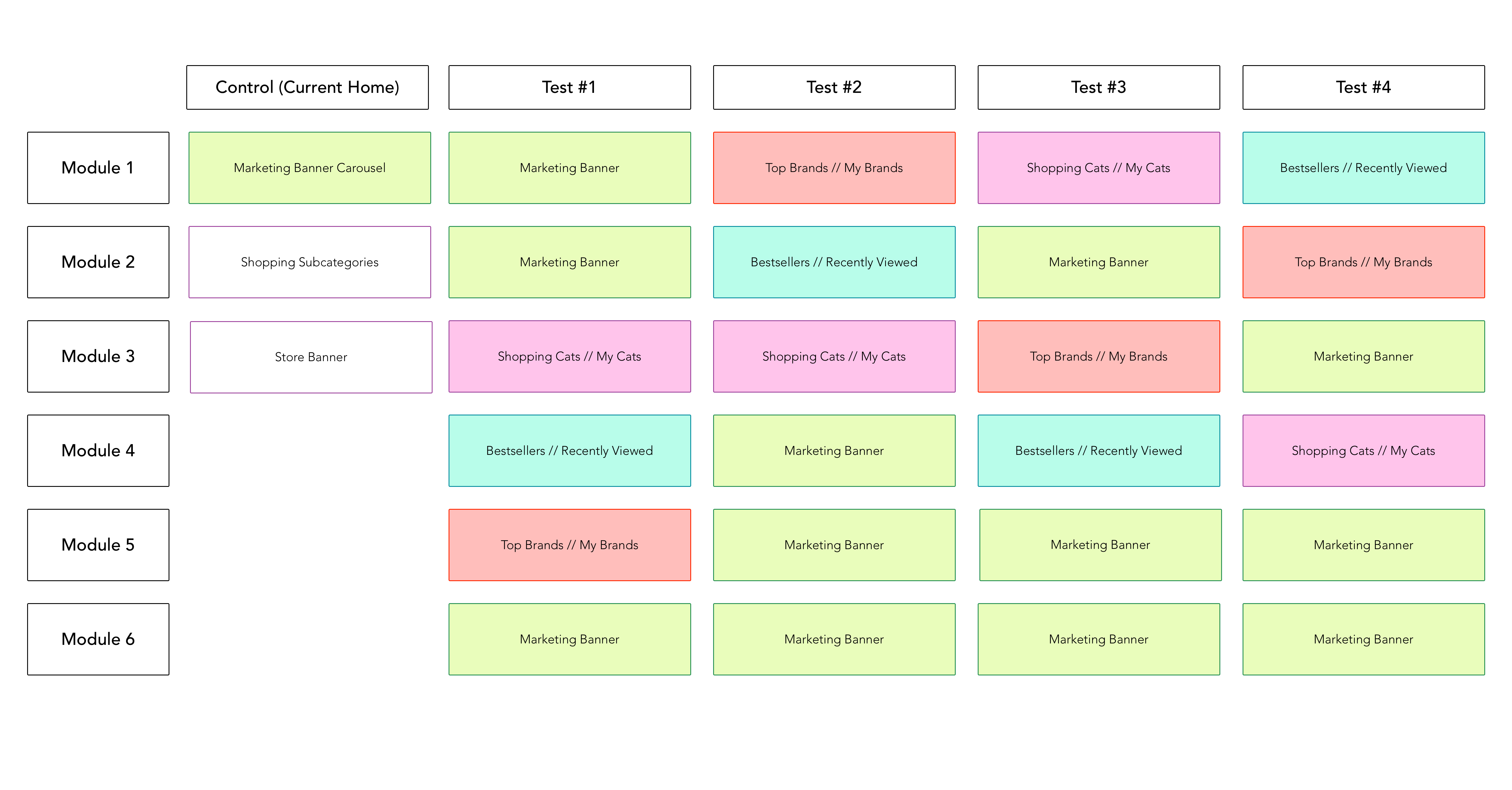
Because the marketing assets received little attention in the current homepage most of the designs surfaced just one banner ad near the top of the page but pushed the remaining two to the bottom. To ensure that users could access browsing categories, shopping categories were near the top (at least one of the top four modules in each variation).
We launched the different homepage variations and collected data on usage. From this experiment, we learned that the variation that surfaced the recommended products closer to the top performed best. With this version, product views, add to bag and checkout conversion were the strongest.
In addition to A/B tests, we also gathered customer feedback through qualitative usability tests. We presented the variations to users to see if they could complete primary tasks with the new homepage designs. These users also provided feedback on what they liked and disliked about the homepage designs. From this testing, we found that it is important to surface the shopping categories higher up on the page. This is especially important for new users who are looking for categories to begin browsing. Customers also expressed an interest in finding out about deals and sales events.
FINAL DESIGN
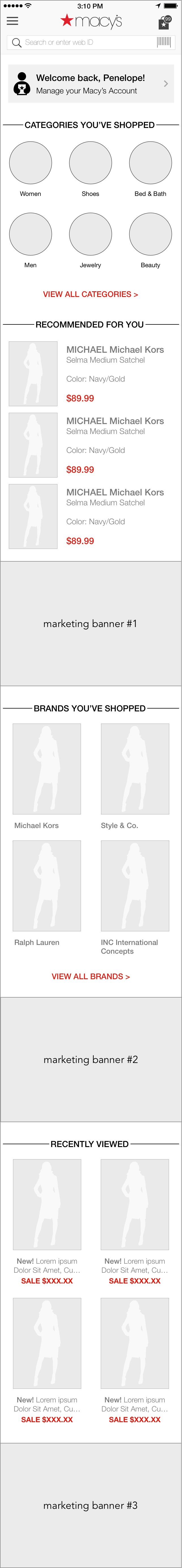
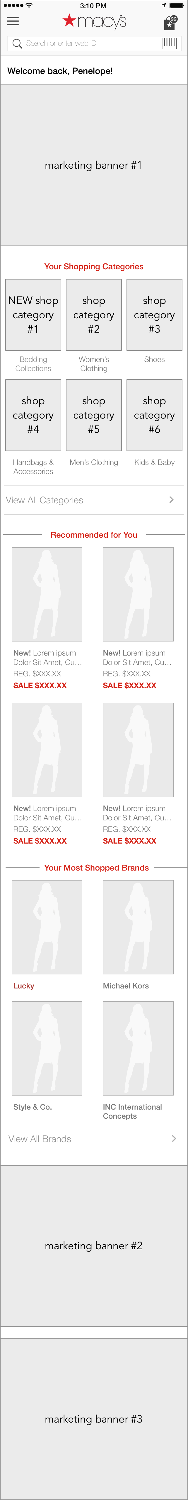
With the results from the first round of experimentation and user feedback, we reworked the homepage design and module order. Shopping categories and the first sales banner were pushed towards the top of the page. Recently viewed products followed these initial modules.
Final design:
