Macy's Lists
Building engagement through the introduction of a wish list feature
SUMMARY
In 2017, I worked on a project to add wish list functionality to the Macy's and Bloomingdale's apps. The goal of the project was to increase conversion and retention rates. Our customer and competitive research indicated that wish list funcationality was common across other retailers and valuable for regular brand shoppers. Additionally, saved lists would mean additional data points that could be leveraged to surface relevant and personalized product sets to customers.
CHALLENGE
Wish lists were first introduced on the Macy's and Bloomingdale's website so the purpose of this project was to build parity across channels. Because the app feature came after the introduction on web, we were able to leverage previously collected data to make informed decisions about what aspects of the feature were most important to our customers. The list feature on web included a suite of management features that were overly complex and underused. With this data, we hoped to prioritize features in a way that reduced cognitive load and made list use and management easy for our customers.
DISCOVERY
Leading up to the design phase, I conducted competitive research from other apps and collected relevant data on our customers' list usage:
Nordstrom's Wish Lists:
Shoppers can save items to a single list and find another shopper's list.
Amazon's Wish Lists:
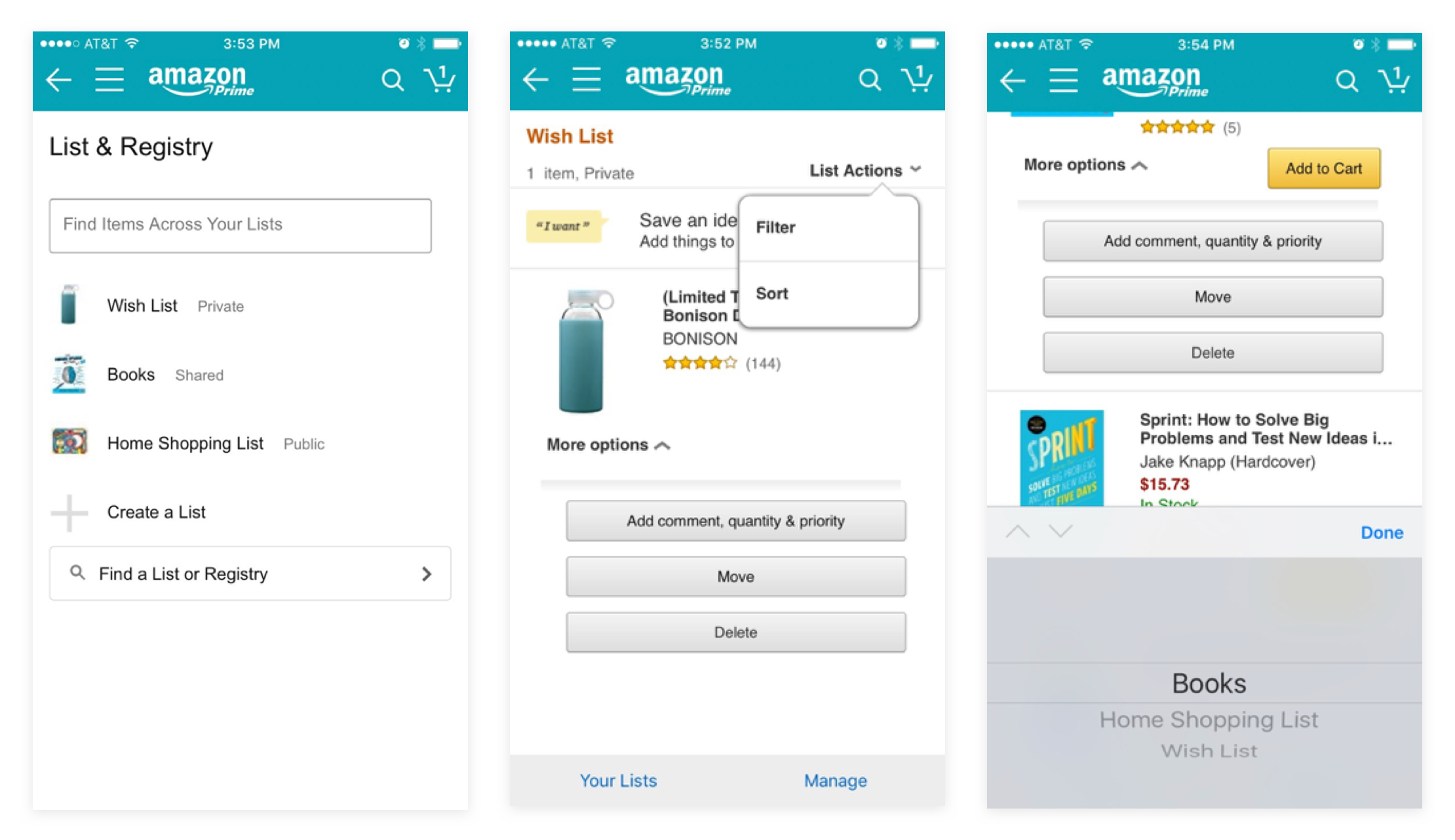
Shoppers can save items to multiple lists, prioritize items and find another shopper's list.
Walmart's Wish Lists:
Shoppers can save items to multiple lists, scan to add items and find another shopper's list.
In the competitive landscape, there was a range of list functionality offered on the apps. Some retailers provided a suite of list management tools that made wish lists similar to a registry. Customers could makes notes in lists or prioritize items. Some retailers offered features that made list making social. For example, you could add collaborators or share your list and allow someone to buy something from it like a registry. And other retailers integrated store features, such as the scan tool, with lists to make it easy to add items while shopping in the store. On the other end of the spectrum were retailers like JC Penney and Nordstrom. These retailers provided basic wish list functionality with fewer management or collaborative options.
Macy's App List Data: 2015 vs. 2016

App customers were already the most engaged list users.
Macy's and Bloomingdale's list usage data indicated that app customers were the most engaged with lists but rarely had more than a single list. Customers with lists had a higher average order value. Given some of the data we had collected as well as considering competitor examples of lists, there were a few areas where we proposed deviating from web:
- Guest Lists: a majority of app users were signed in when using the app so it did not make sense to build out guest list functionality. Additionally, the logic around how long to locally save these items for guest users was complex and not very user friendly.
- Multiple Lists: since the overwhelming majority of users only maintained a single list, our team proposed reducing list support to just a primary list to simplify the feature.
- Store Tools: the apps offered a number of store-specific features and to further support store shopping, we wanted to explore additional features to make easier to find items from your list in store.
I pulled all the research together into a presentation to share with the product team and stakeholders. This review prompted a discussion of which lists features to implement in the app. As a team, wed decided to concentrate on the signed in experience as well as add store related features. Although stakeholders understood the concerns around complicating lists with multiple list support, they were not ready to remove the functionality on the site and since app shoppers were the most avid list users, wanted to provide full access to multiple lists. We recommended further monitoring of this feature and potential future simplification if usage of multiple lists did not increase.
IDEATION
Because there were a number of features we hoped to tackle for this project, I worked closely with the product manager to plan the roll out of new list features. We made sure that features released first had a greater customer benefit and were not reliant on too many other dependencies. Therefore, we started with ways to add items to the list from the product page and browse grid.
To start, I created flow diagrams to show all the different ways users would access lists (i.e. browsing items, from their bag or the list section). These initial flows included scope that was paired down as the project moved forward.
Proposed App User Flows
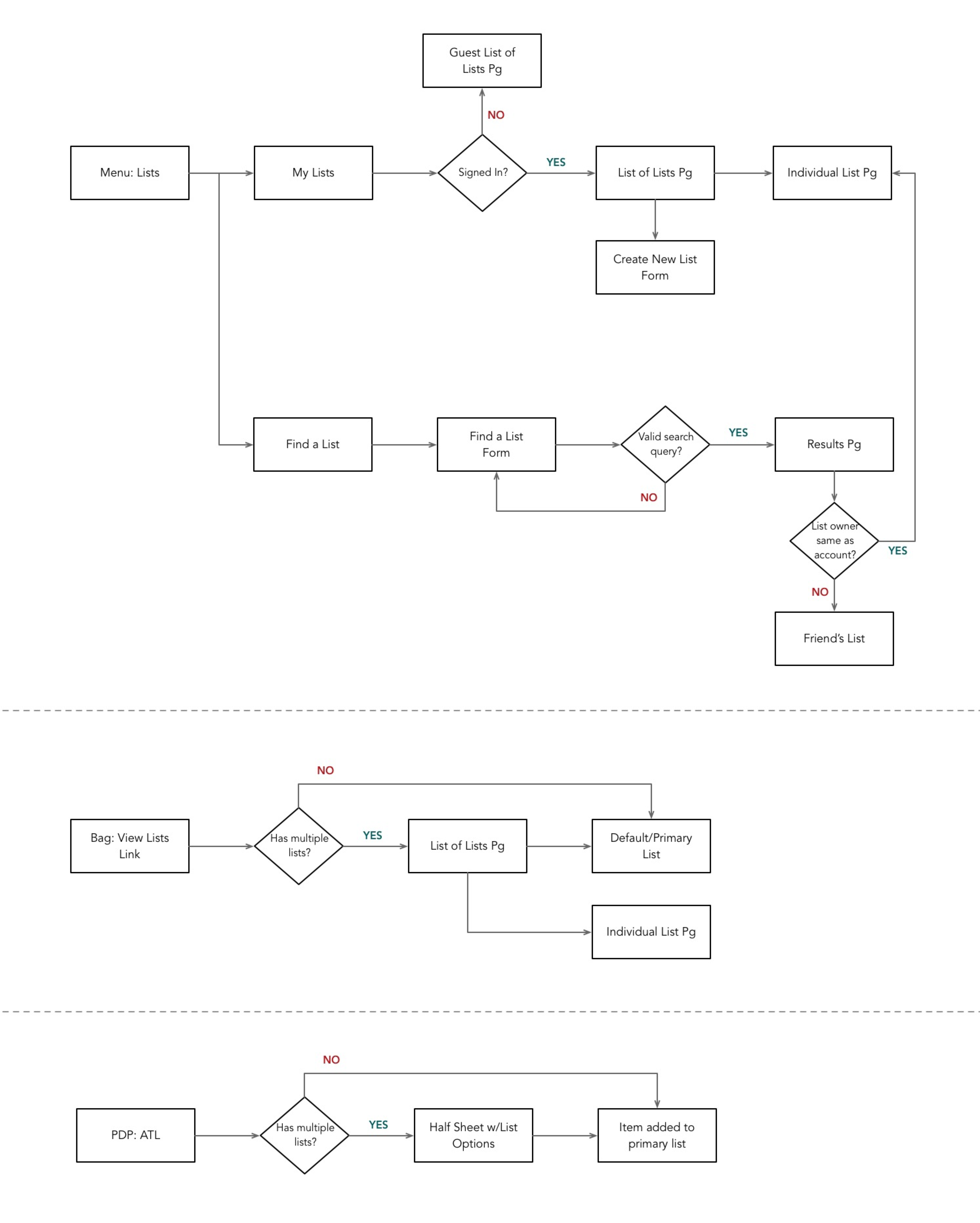
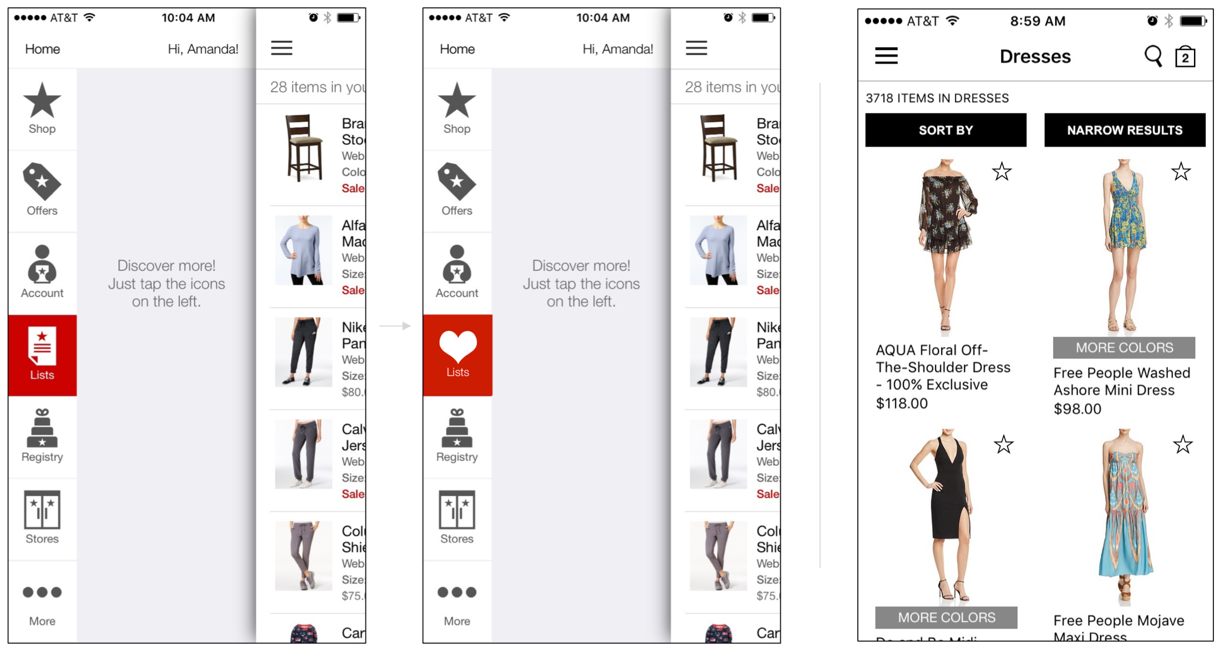
In the current app experience, users had access to list from the slide out menu. Customers could view their lists and add items to their bag but could not add items to their list when browsing. This was a major limitation and one that we hoped to address first. We wanted to make it easy for customers to save items to their list while browsing. A common pattern seen in other apps and sites included a quick add option from the product grid. Typically, users would see either a heart or bookmark icon to indicate the item could be added to their list.
As part of the review of existing functionality on both apps and sites, I worked with research to survey customers on their understanding of these icons. We tested the concepts of hearts on the product grid to signify saving to list. This was mostly understood although some participants thought selecting a heart might also mean liking an item. We also had to ensure that we were not using icons to represent more than one concept and icons that were appropriate for a quick selection from the browse grid. For example, the Bloomingdale's website and app used hearts to signify review ratings. Macy's had previously used a paper and pen to symbolize lists but this icon was not suitable for use on the browse grid. Ultimately, each brand went with the list icon that was most appropriate for their experience: hearts for Macy's and stars for Bloomingdale's.
Wireframe Concepts for List Iconography
Wireframe Flow & Notes for Adding to List from Browse
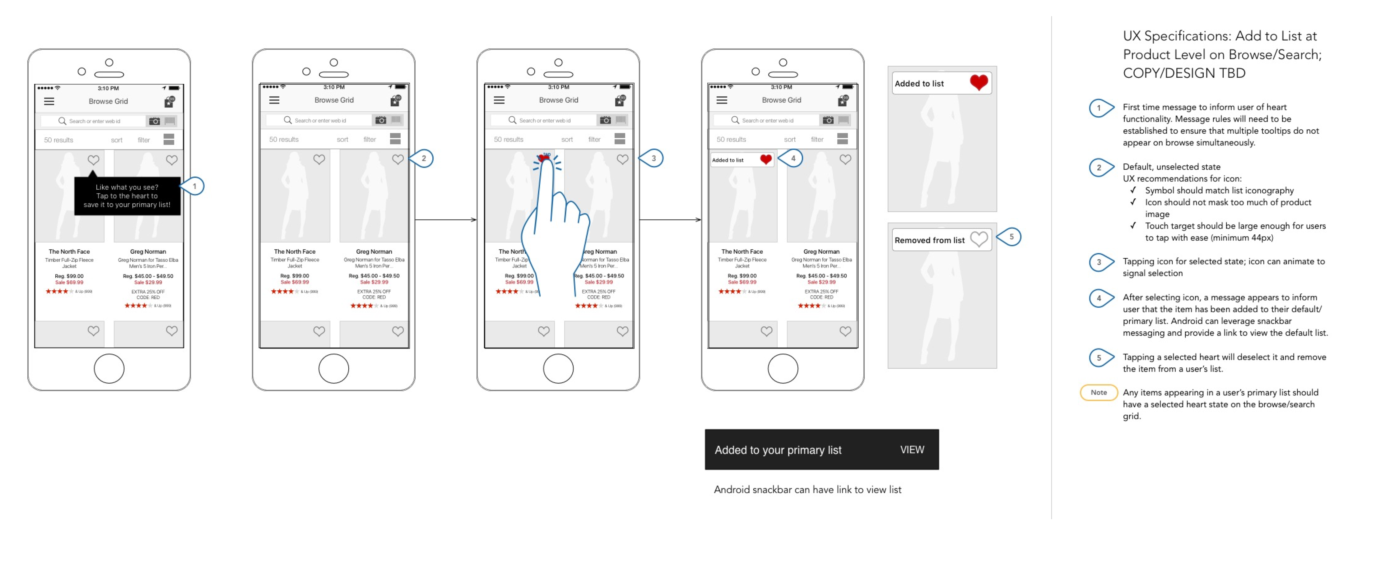
To educate our users about the meaning of the heart icon on the browse grid, I designed a first-time tooltip message that would introduce the icon and inform users about its use. Additionally, since we knew there was some ambiguity around the meaning of the heart symbol, I also included a quick confirmation message that appeared after the user tapped the heart on a product.
I worked with stakeholders, UX researchers and my product team to review the designs. Once we had finalized designs, our developers picked the work while I began to iterate on multiple list support concepts and list management as the next phase of work.
The navigation to the individual list was made more complicated with the addition of multiple lists. We knew that the overwhelming majority of shoppers only had one list but it was a business priority to provide multiple list support to our app customers. Therefore, the feature needed to be discoverable for those who wanted to use it. Given that our app customers were the most engaged list users, there was a hypothesis that app users may create multiple list once the functionality was introduced.
With this information in mind, I set about creating different options to inform users of multiple list support while maintaining familiar app navigation patterns.
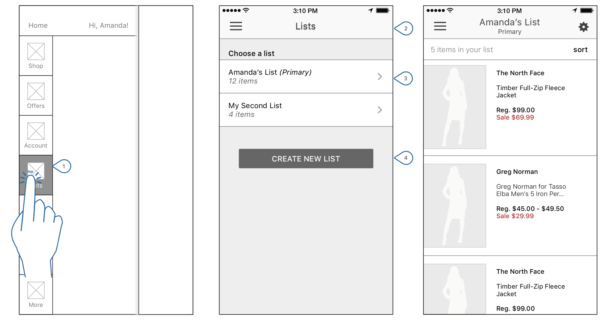
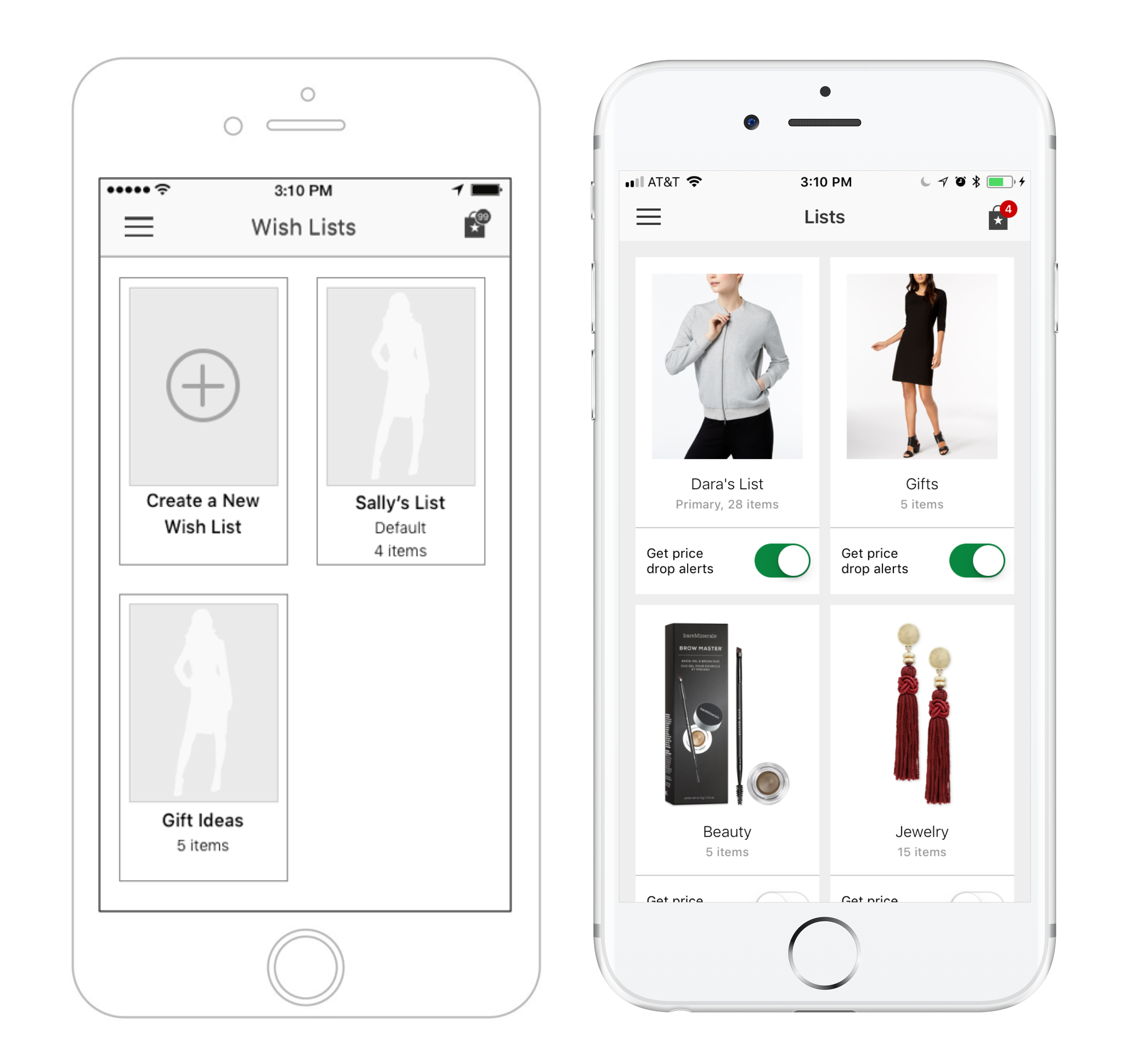
List format for saved lists

Visual "board" format for saved lists
The more visual design using boards was preferred by stakeholders. It had a more inspirational look and feel. The use of thumbnails within each list also provided a quick identifier for users scanning the boards.
FINAL DESIGN
After finalizing the list landing page and individual list pages, I worked closely with a brand designer to finalize the comps. Once comps were delivered to the product manager, I supported developers to ensure designs were built to spec.