Navigation Redesign
Increasing app engagement & ease of use through improved navigation
SUMMARY
After in-depth customer pain point analysis and competitive research, our team decided to design and test alternate navigational models for the Macy's apps. Our primary goal was to make it easier for our customers to manage their accounts as well as discover app features.
CHALLENGE
Navigation had been a longstanding customer concern; however, customer feedback was often centered around the organization of the shopping categories (taxonomy). Business objectives focused on increasing customer retention and engagement with the shopping apps. Based on customer feedback and usage data, we knew our users were not using a number of our store-related features. Therefore, the challenge was to improve the overall navigation of the app to address customer pain points and increase customer engagement and retention through feature discoverability.
DISCOVERY
Navigation was an area that consistently appeared as a pain point in customer surveys. These surveys asked general questions about navigation where users would rate their overall ease of navigating the app. Scores were lower than desired but it wasn't clear what aspects of the navigation posed challenges for our users. Additional research was needed to isolate the specific problem areas.
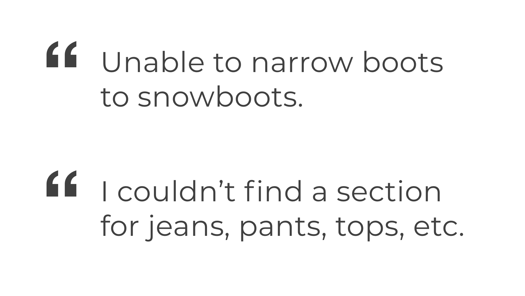
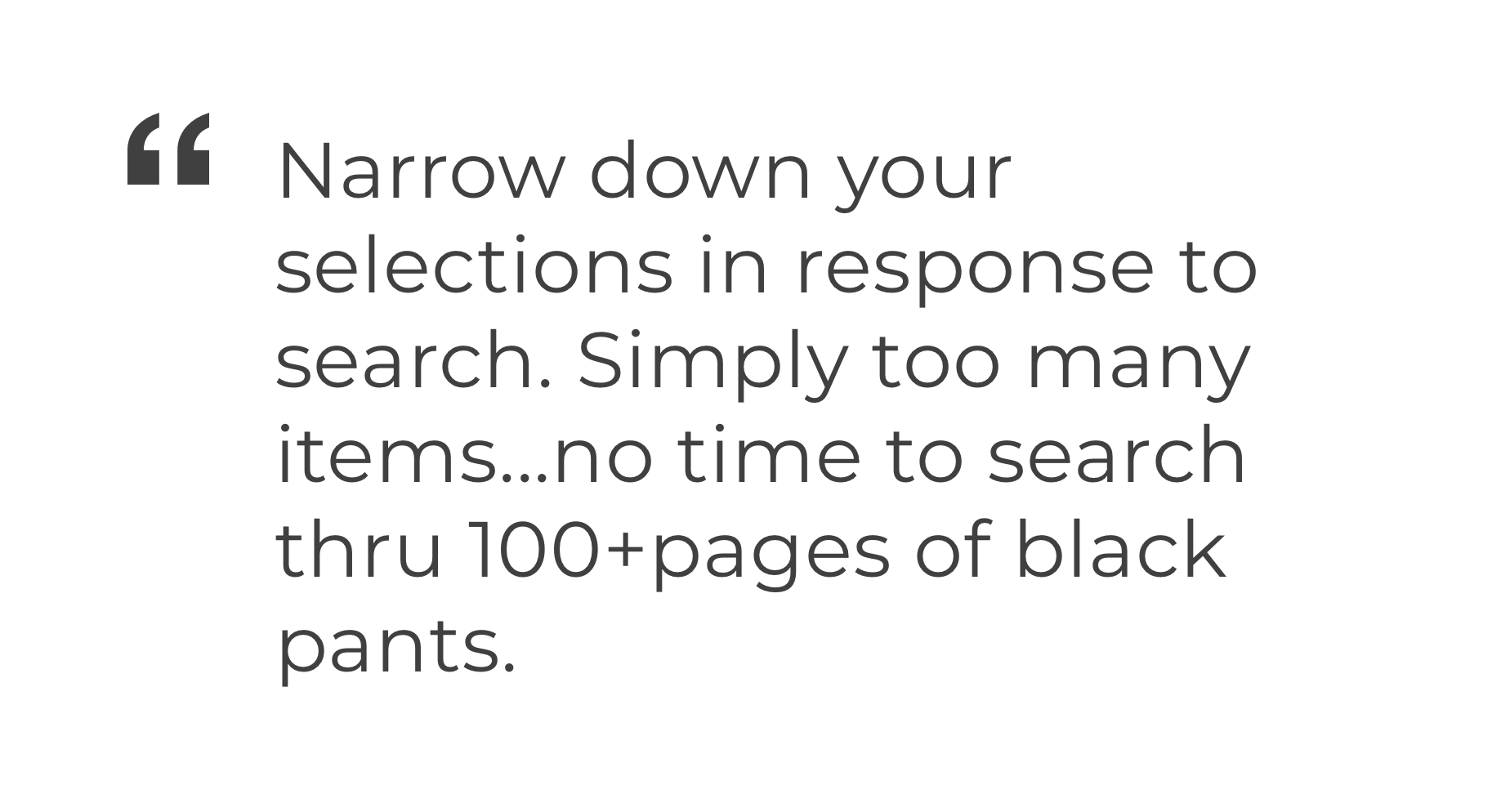
To better understand our users' difficulties, I analyzed open-ended responses to surveys. While some feedback suggested that the side menu (commonly known as the hamburger) was creating more steps to get to popular content, most responses highlighted issues with the taxonomy of the shop menu and inaccurate or insufficient search results.
I coordinated with our user research team to evaluate app navigation to see if a different menu format might address these pain points. We conducted a competitive navigation study with a few other shopping apps that offered different models: bottom tabs (Nordstrom and Walmart), bottom tabs and hamburger (Saks Fifth Avenue) and Macy's (hamburger).
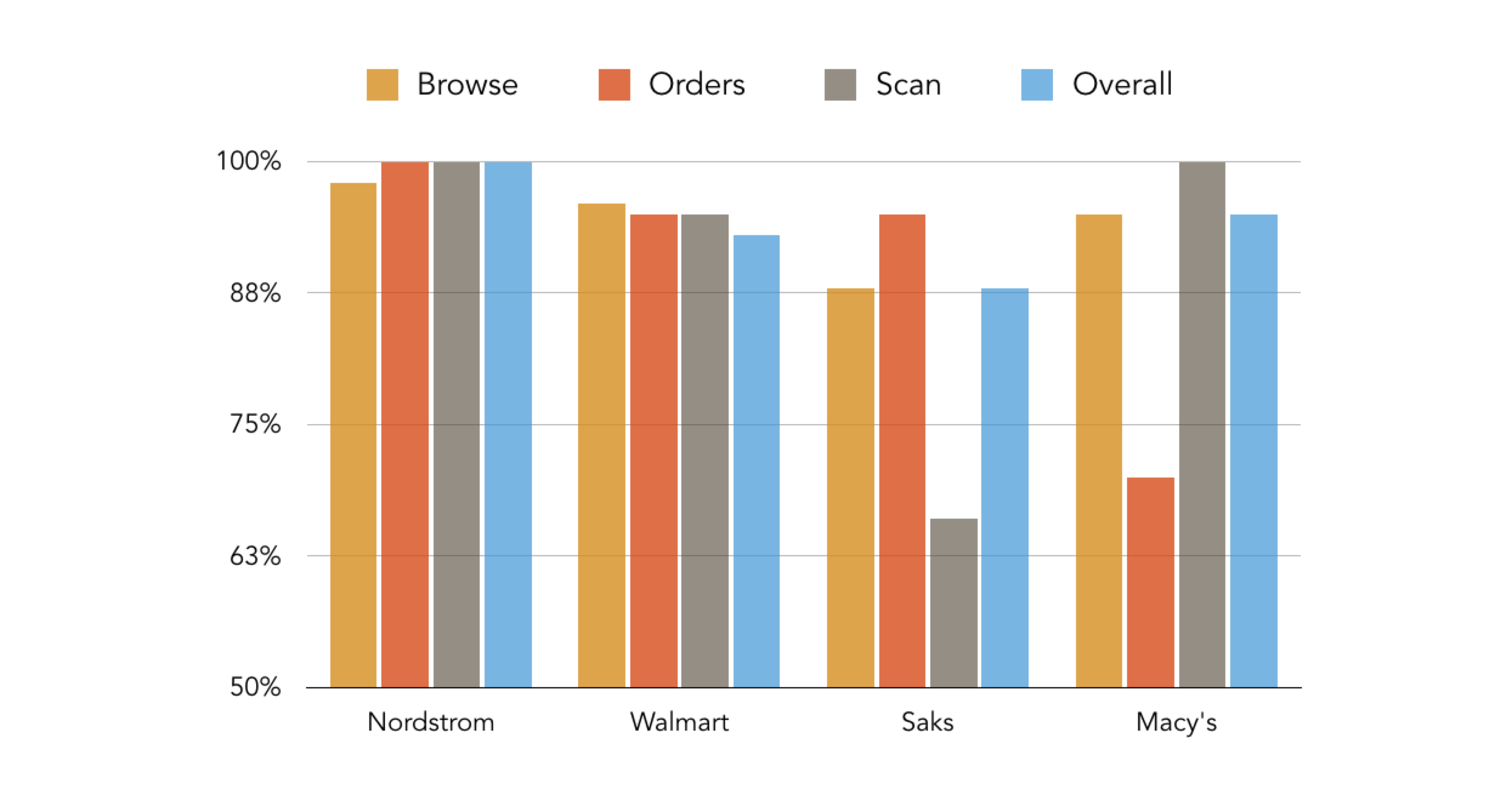
Results of Comparative App Study
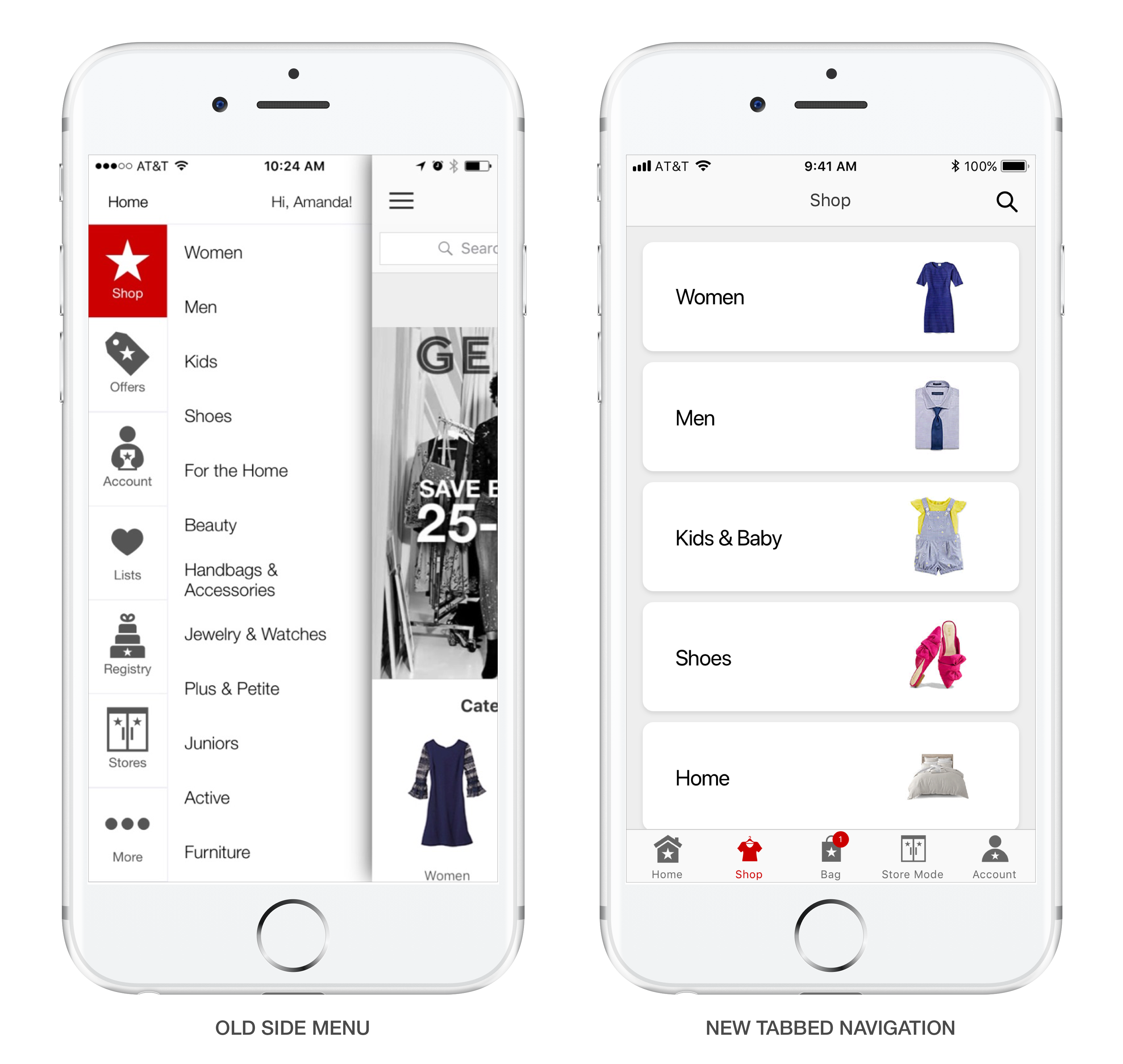
Based on this research, the Macy's app seemed to perform as well as other apps with bottom tabs with the exception of navigating to the account section. To access your order history on the Macy's app required a user to open the side menu and select account from the list. In contrast, Nordstrom and Walmart provided easy access by dedicating a persistent tab to account.
Knowing that the account section was one of the primary tasks for our users, we designed and tested a solution that offered a link to your account from the homepage. While this did provide some improved ease of use for users, studies and data suggested that most users passed over this link and opened the side menu instead.
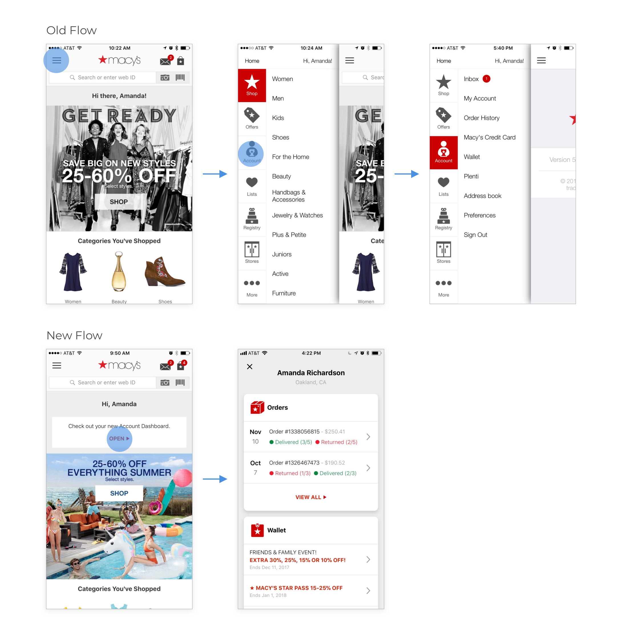
Account link on homepage for easy access
At this point we knew we had to find a better way to deliver account information to our users but we also had to ensure that any new design helped users discover the breadth of features available in the app. In addition to traditional online shopping and account management, the Macy's apps also had useful tools that made it easier for users to shop in the physical stores (i.e. scanning, store maps and mobile payments). There were a number of case studies suggesting that bottom tabbed navigation improves engagement because it always exposes the primary set of features in an app.
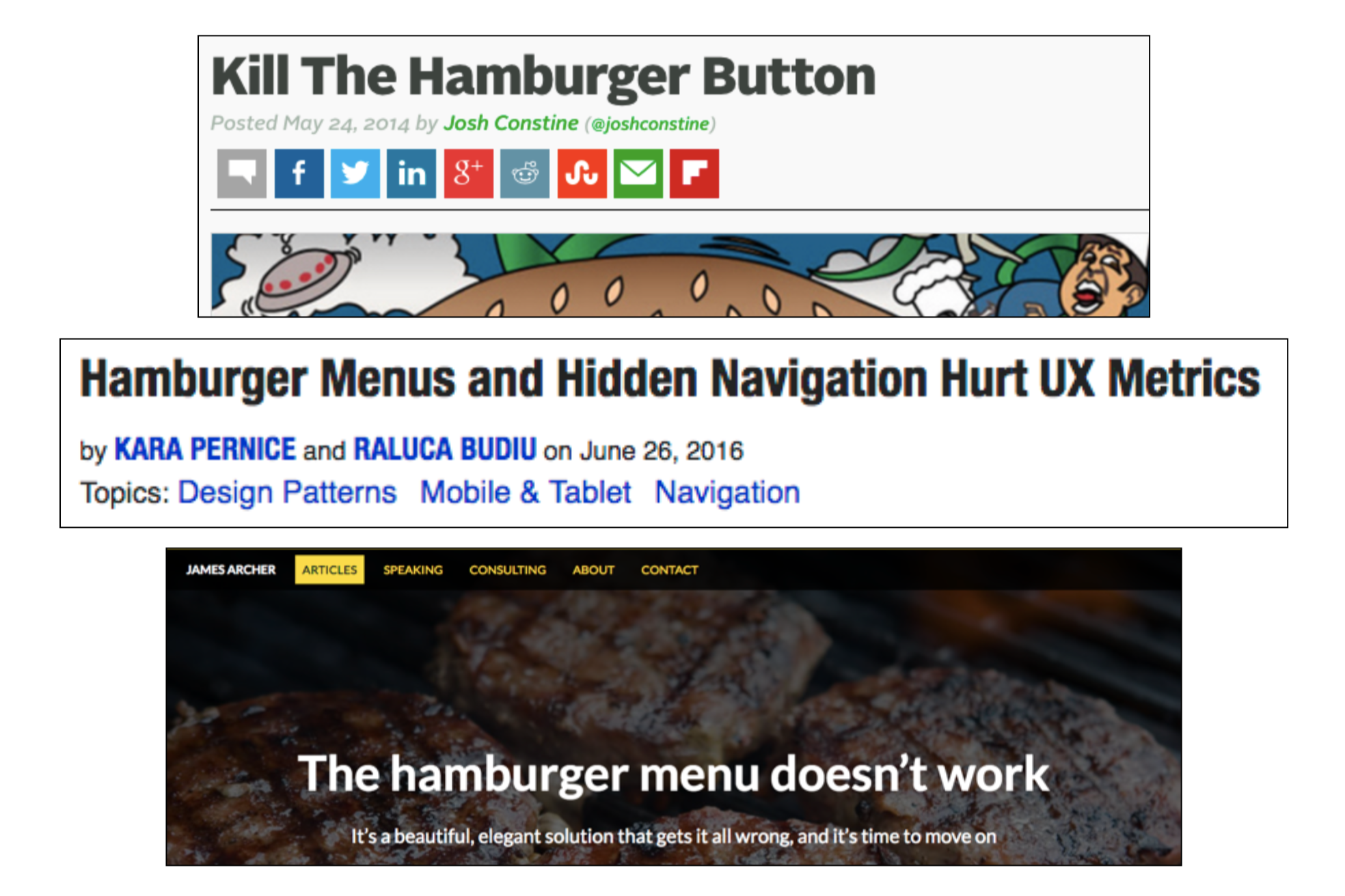
Case studies & UX articles against the use of the slide out menu
Industry trends were moving toward a bottom tabbed navigation. This was especially evident across iOS apps. Though a bottom navigation was less common in Android design, it was officially added to the Material Design guidelines in the spring of 2016.
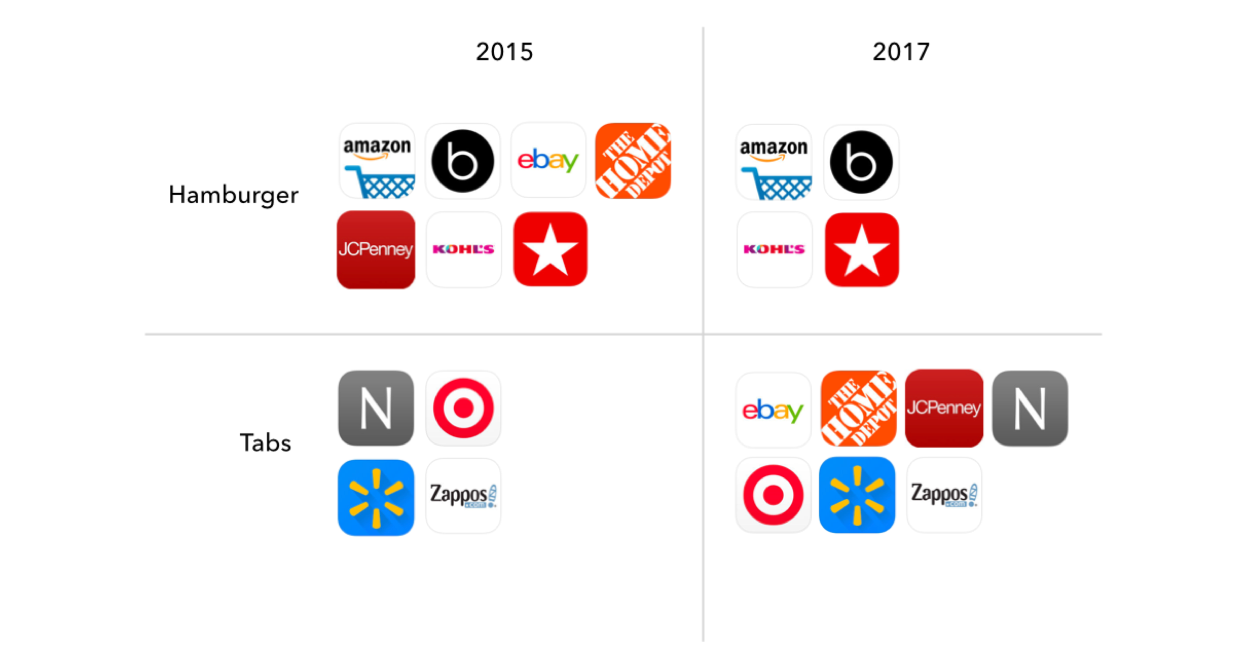
iOS Apps Moving Toward Bottom Navigation
Based on industry trends, user research and case study examples, we decided to consider a tabbed navigation for the Macy's apps. Before sketching and wireframing, additional baseline data was needed to understand where our users spent most of their time in the app. What parts of the app received the most traffic? And what parts of the app were harder to find and may need better visibility?

Session Traffic to Sections of the App
Data indicated that most sessions only included a visit to one section of the app. That section was most likely shop, which included any of the browse and product pages. Our users were rarely visiting the stores pages. This section included many new features to support the in-store shopping experience.
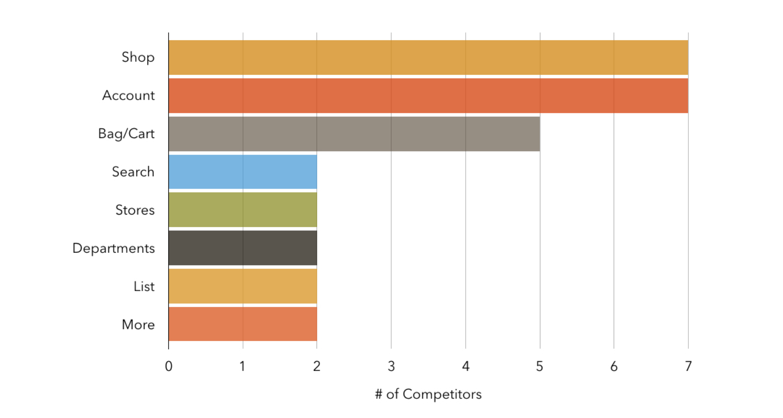
I looked at what destinations our competitors included in their bottom navigation. Shop, bag and account were the most commonly found features presented in the tab design:
IDEATION
After thoroughly reviewing usage patterns and competitors' designs, I began sketching some initial proposals. I kept in mind the following guidelines:
- Show only the most important destinations that require global access.
- Navigation must be self-evident.
- Communicate a user's current location.
- Display the same tabs in every location.
- Label tabs to avoid uncertainty.
These early sketches helped me begin to understand how changing the navigation would affect existing page design. I created quick paper prototypes to get a sense of how the navigation might work with different tab destinations.
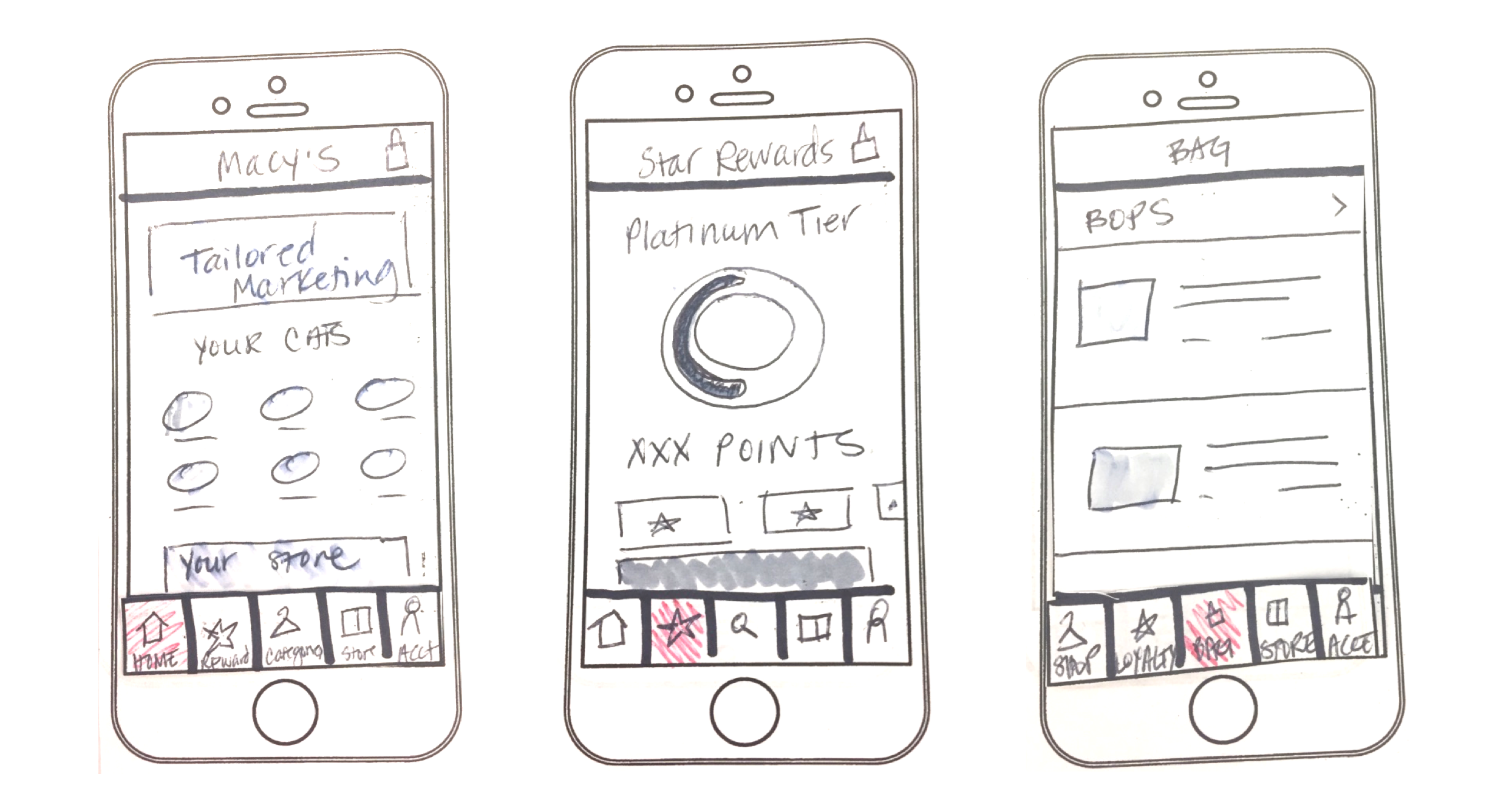
Early Wireframe Sketches
While navigation touches every part of the app experience, we did not have the time or budget to update all pages and flows. Therefore, it was critical to get a sense of which user flows might require additional UI updates. While testing out the different tabbed configurations, it was also important to comb through all the existing flows to define new navigation guidelines and identify any legacy flows that might conflict with the tabs.
EVALUATION
Once I had identified several concepts, I created prototypes to test a few different ideas (Versions A, B & C shown below). Each concept represented an array of different options to present to our users. I worked with my user research counterpart to set up a test plan that reflected the primary tasks as well as discovery of features that historically lacked visibility.
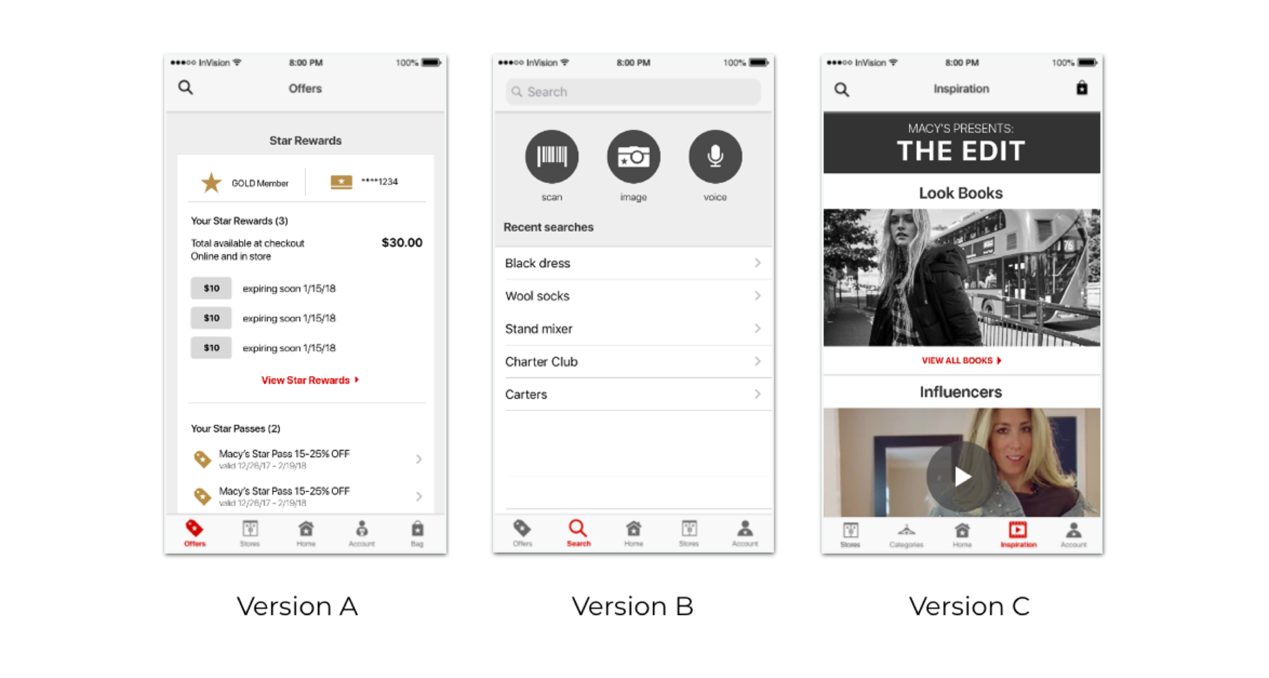
From this first round of testing, we looked at a number of primary tasks to see how different navigational arrangements might impact our users' ability to complete core activities. Here were some of the main takeaways from this study:
- Not all users were able to easily shop by category when links were only found on the homepage.
- Users had difficulty finding offers.
- Users find inspiration on the current homepage design. A dedicated tab may not provide much value.
- Some account features were not easily noticed in a list format.
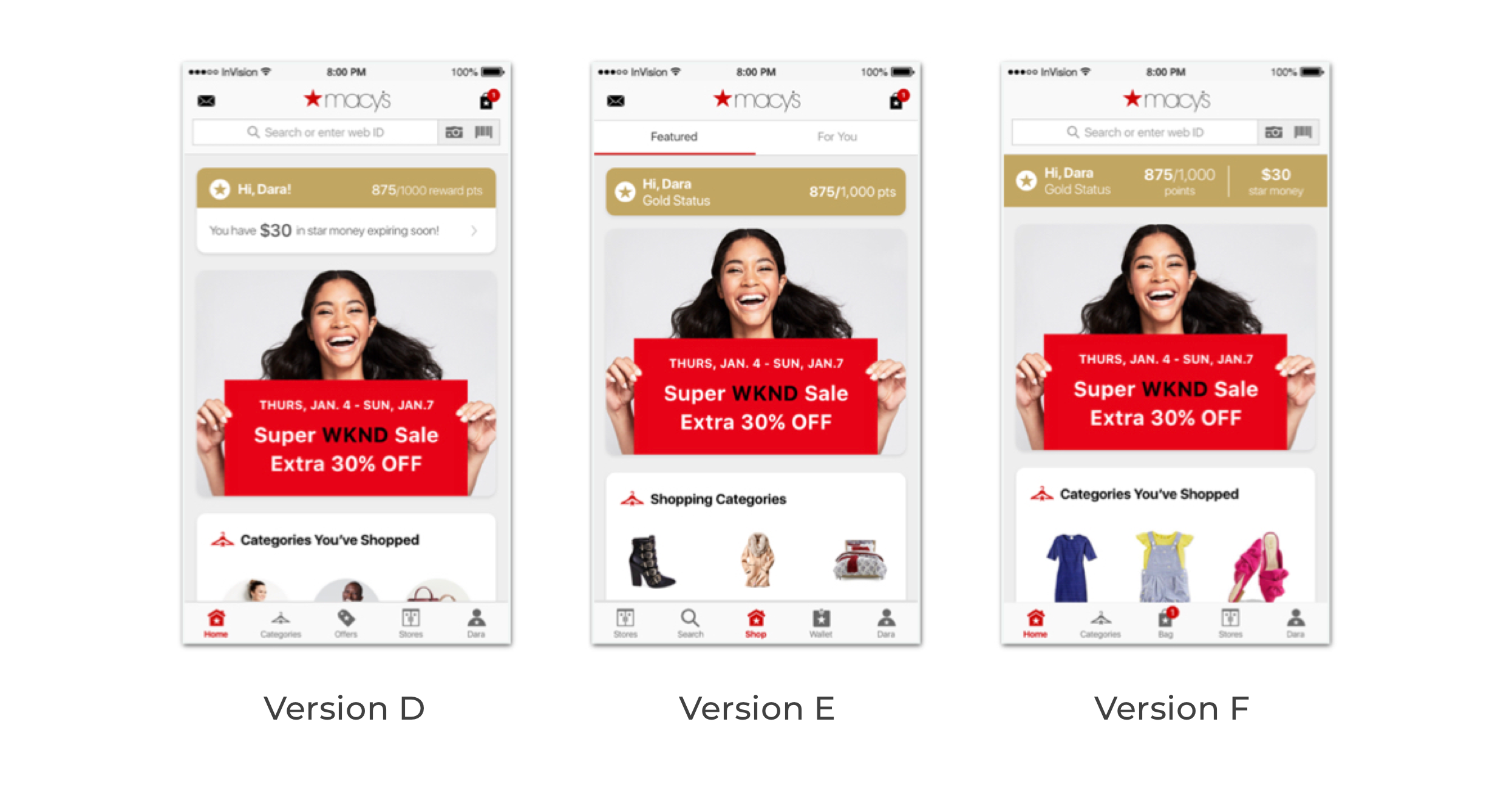
In the next iteration of designs (Versions D, E & F), I built prototypes to test concepts that drew upon the successful features of the last round. The primary goal was to identify the tab destinations that that provided the most value and allowed users to easily accomplish core tasks. Additional rounds of testing would help us determine which features should be global (always accessible) versus contextual. For example, search is important but should it persist in the global navigation versus more contextual placements (i.e. header on the homepage and across shop flows)?
The second round of feedback helped us rule out some design concepts as well as identify designs that were successful. In some cases, there were multiple concepts that were usable. For example, the account page was equally usable both in a card format (exposing some information up front) and as a list. For many of these instances, the final decision on which direction we went often came down to what was realistic to build given various constraints. As we considered the nuances of various scenarios, often one design proved more practical. For instance, with the account landing page, we needed to consider multiple states: signed in, soft sign in and guest. Each state would allow different types of information to be on display. As a result, the list format of the account seemed to be the simplest approach.
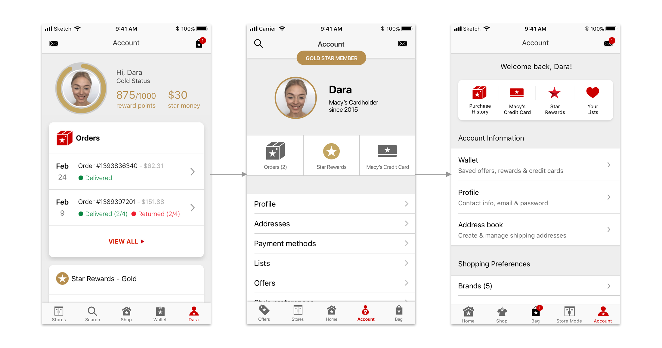
Evolution of the Account Tab
Ultimately, we landed on the following tab destinations based on the user research as well as business priorities: Home, Shop, Bag, Stores & Account. The homepage offered a page for personalized messaging as well as various marketing about sales and offers. In the Shop tab, users could view the complete menu. We decided to reserve a tab for Bag because of its value to the user and to free up space in the header for more contextual actions. Store became a tab because the store related features were considered a unique part of the app and part of the strategy for user acquisition and retention. Finally, account was the final tab because it's a top destination for our users and follows an existing pattern.
USER EDUCATION
To help existing app users adapt to the new menu, I designed and tested a few new feature messaging options. I had competitive examples of new feature messaging from other apps. I also reviewed best practices for this type of messaging through case studies and UX articles. I also tested a few options to see how users responded to different styles of messaging.
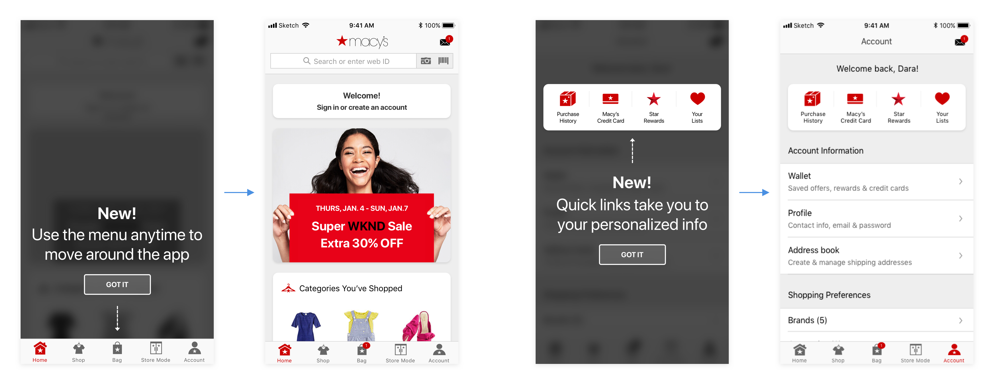
Overlay treatment spotlighting new navigation and account page
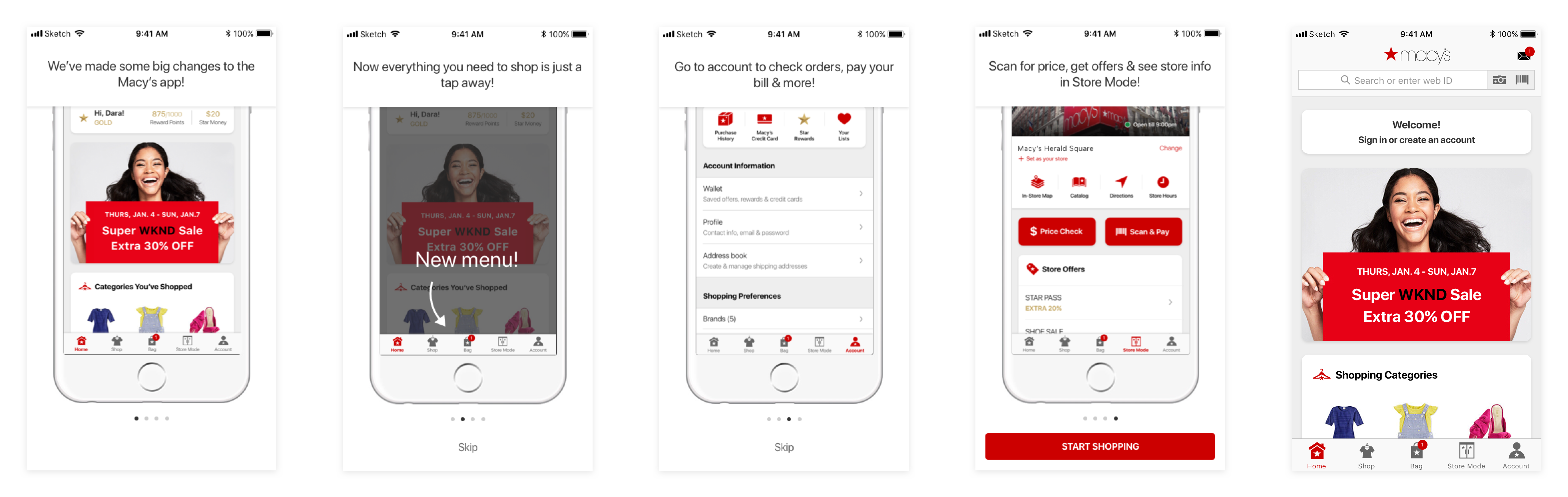
Walkthrough of each new menu tab
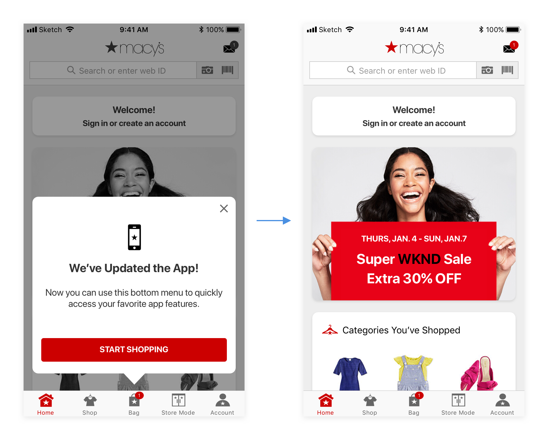
Overlay tooltip with messaging
Almost all users preferred brief messaging that was not as disruptive. Most preferred to explore the app features on their own instead of going through a walkthrough. In the end the spotlighting treatment was the most effective at quickly communicating the new menu.
PROJECT MANAGEMENT & COLLABORATION
This project was working under a tight timeline to deliver the updated navigation for both the iOS and Android apps prior to the 2018 holiday season. We also wanted to have a buffer to address any potential issues that may arise after launch. There were a number of internal teams whose content was featured on pages that needed to be replaced or updated. To ensure that all parties were informed of the planned changes and involved in the discussions of the new designs, I facilitated bi-weekly working group meetings to review design concepts, user research findings and development progress. These collaborative meetings were mutually informative. If a design concept lacked a requirement, the invested party could provide input. As a result, there were fewer internal conflicts and inefficiencies which allowed our product team to move faster in building the feature.
FINAL DESIGN
After multiple rounds of user research and regular reviews with business partners, we landed on a design that could be built and launched before the busy holiday season. As with most projects, we did not have the time or budget to complete all that we hoped to include, but we maintained a list of additional improvements to consider post launch. Additionally, we wanted to adapt once we had more user feedback after launch.
Final design:
HINDSIGHTING
After the new navigation launched in September 2018, we monitored app KPIs to understand its impact. We also reviewed customer feedback from app reviews as well as customer surveys. Overall, there were no significant usability issues and users seemed to adapt easily to the new app structure and menu.
Over the course of a few months, we noticed increased monthly average users as well as more traffic to features that were less discoverable in the old navigation. For example, now that Store Mode was featured in the tabs, more customers were exploring it and seeing what the app had to offer for store tools.