Civic User Test #1 - Open Disclosure
For our first Open Oakland Civic User Testing study, we wanted to gather feedback about the Open Disclosure website (www.opendisclosure.io). This in-person study took place at the West Oakland Public Library on Saturday, February 21, 2015 with 11 participants.
Open Disclosure is a website that displays campaign finance data for mayoral candidates in Oakland, California. The site reports campaign contribution amounts and sources. From the Open Disclosure team:
“Open Disclosure’s goal is to introduce a high standard of clarity and transparency to the disclosure of Oakland’s local campaign finance so that the public can understand how local campaigns are financed.”
We were interested in finding answers to the following questions:
Segmenting
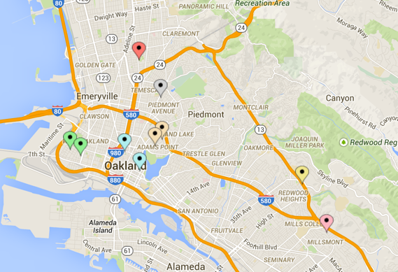
In January 2015, we sent an email to 131 Oakland Civic User Testing participants who had previously shared information and an interest in participating in user testing sessions. Recipients completed a short questionnaire about their availability, interests in elections, and time spent online. We received 26 responses and later confirmed 11 participants who lived in 7 neighborhoods of Oakland (see map below).
Test Format
The purpose of this test was to gauge user interest in campaign finance and evaluate the usability of the Open Disclosure website. We designed activities that would help us collect a combination of qualitative and quantitative data.
Each test session consisted of multiple parts. First, users explored the website in a one-on-one session with a test moderator, using a laptop. The sessions were recorded with screen capture software (such as QuickTime or Snagit) and their verbal responses were also recorded. Most stations were also accompanied by notetakers. Next, users participated in a group discussion, also led by a moderator. Finally, users completed a brief post-test written survey.
Please note that in some tasks, we were unable to report the results of several test stations due to technical difficulties or insufficient or invalid data collected.
Results
Qualitative Interviews
Before looking at the Open Disclosure website, participants answered questions about their experiences learning about local candidates’ campaign finances in prior election cycles.
Did you follow the news about the Oakland mayoral election last fall?
Every participant reported following the election.
What were the reasons for your interest in the election?
7 of 8 participants followed the election based on an interest in the future of their community.
When you followed the election, did you think about how the candidates got money for their campaigns? Is there anything you wondered about?
7 of 8 participants reported an interest in campaign finance. A little over half of the group (5 of 8 participants) had thought about the sources of campaign finance.
Where do you think you could find information about this?
A third of participating users said they would look for campaign finance online. Another third thought that the newspaper could provide information about campaign finance. One participant cited the radio as a potential resource for campaign finance data.
What kind of information would you like to find online about local campaign financing?
All 8 participants expressed an interest in learning about the source of campaign finance. Users would also like to find information about which candidate raised the most money (3 of 8 participants), how much funding was raised (3 of 8 participants), and how the money raised was spent (2 of 8 participants).
Usability Results
Task 1: Imagine you are interested in learning who has donated to Libby Schaaf’s campaign, please see if you can use this site to find the answer. Along the way, if you see anything else on the site that you find interesting, feel free to look at that too.
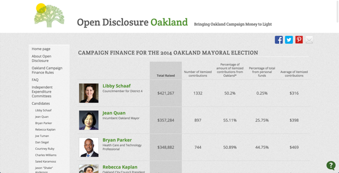
Users had little difficulty in identifying contributors to mayoral candidates’ campaigns. All participants (10 out of 10) successfully noted contributors to Libby Schaaf’s campaign. The majority of users were able to click on a candidate’s image or name to navigate to that candidate’s page to locate information about contributors and amounts donated. The average amount of time needed to complete this task was 1 minute and 35 seconds (range: 0:13 to 3:27).
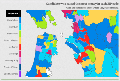
Task 2: Could you try to find out which candidate raised the most money in your zip code?
5 out of 8 participants were able to use the website to determine which candidate raised the most money in their zip code. Although this information is available on the homepage, many users did not notice it, and instead found the answer by looking at multiple candidate pages.
Many users who noticed the map did not immediately locate their zip code. Many participants used the mouse cursor to hover over multiple regions (which prompted the zip code numbers and candidate information to appear in a chat window below the cursor) before finding their home zip code. For those participants who finished this activity, the average amount of time needed to complete this task was 1 minute and 32 seconds (range: 0:30 to 4:46).
Task 3: Could you try to find out who started raising money the latest?
7 out of 8 participants identified Saied Karamooz as the last candidate to begin fundraising in the mayoral election. The average amount of time spent identifying this information using the website was 1 minute and 3 seconds (range: 0:20 - 3:00). As with the second task, some users first explored the candidate chart at the top of the homepage to answer this question before searching the rest of the page. A few users scrolled past the line graph without realizing the information it provided.
Task 4: Could you try to find out which candidate gave themselves the most money?
8 of 9 participants completed this task successfully, citing the Karamooz campaign as the one that raised the largest percentage of contributions from the candidate’s personal funds. The average amount of time spent identifying this information using the website was 1 minute and 3 seconds (range: 0:18 - 1:05). Observations from this task and others suggest that users found multiple ways of identifying information about self-funded campaigns: the main candidate chart on the homepage, pie charts on candidate pages, and top contributor lists.
Task 5: Ok, now imagine that you found something that you liked or that didn’t work well on the site. Could you try to send some feedback to the site’s creators?
When asked how they would send feedback, 6 out of 8 participants located one of the methods to contact the site’s creators (i.e. email provided on “About Open Disclosure” page). Many users identified the email icon located in the upper righthand corner of the page. Some users searched for a “contact us” link in the header or footer, but when that was not found, navigated to the “About Open Disclosure” page instead. Few users made note of the ‘sticky’ question mark. The average time required to complete this task was 1 minute and 55 seconds (range: 0:05 - 2:00).
Group Discussion Results
What did users find easy, interesting, hard, frustrating?
Easy
Participants reported that it was easy to identify specific candidates using the chart. Multiple users noted that the information was clearly presented and that they liked the clean layout of the site: "I don't ever see it [campaign finance data] so clearly." Participants also enjoyed the visualizations presented on the site.
Interesting
Areas of interest included the breakdown of campaign finance spending (pie charts presented on the candidate pages), money contributed from outside of Oakland, and a general appreciation for the different charts and graphs. Users also seemed surprised and intrigued to learn how much candidates contributed to their own campaigns.
Hard/Frustrating
When asked what was frustrating about the site, users reported that there was a lot of information presented and some features were difficult to locate. For example, a couple participants noted that it was challenging to isolate a particular donor since the contributor lists are not arranged alphabetically. Some users felt that it was hard to discover the information presented below the chart. One participant did not find the color-coding of candidates helpful, while another participant felt the number of colors on the site impeded her ability of finding information: "too many names, too many colors -- I was dazed going around the site." Finally, a couple participants cited difficulty using the map to identify which candidate had raised the most money in their zip code.
Was there anything users were expecting to find but didn’t?
More than one participant expressed interest in learning more about individual contributors’ affiliations and the corporate contributions:
A site where you could actually click on a candidate and then see the actual donors and where the money is coming from, not just a group hiding behind a name or a political action committee. Because you never really know 100% where the money's coming from. Most people don't really have time to sort through that stuff anyways.
Users were also curious to see more detailed information about contributions, such as when individual contributions were made.
How would users change the site?
When asked about what suggestions they have for improving the website, participants’ responses centered on three common themes:
Users suggested labeling zones on the map with zip codes and providing additional ways of sorting and filtering contributors (i.e. alphabetically, by organization). In addition, participants were curious to learn about the reasons for spikes in contributions. One user suggested focusing on top ten lists of contributors and allowing users to expand to see more. The long lists of contributors seemed to overwhelm users. Recommendations included restructuring pages to highlight the most important information.
A couple users suggested reorganizing the layout of the website in a way that would make it easier to notice the charts and maps. One user specifically recommended stating the message or purpose of the homepage of the website:
It felt like it lacked context... like when I hit the homepage... like what this site is, what its goals are, something to help me understand the scope, what we’re doing here before hitting me with a bunch of information.
Additionally, one participant noted that the title “Open Disclosure” implies a broader look at campaign finance in Oakland, not just mayoral elections. Using a name or title that more closely represents the information presented may better introduce visitors to the site’s content.
Participants expressed an interest in knowing more about the donors and the contributions made. A few users felt disappointed in seeing a long list of unfamiliar names of contributors without any associations, such as companies, that might make the information more meaningful.
As one participant voiced when asked what she expects to see in a website about campaign finance, visitors want to know “who’s behind the money and what their agenda is.”
Summary and Next Steps
After reviewing the feedback provided by participants during the civic user testing sessions and exchanging our observations of how users interact with the website, we identified areas of the Open Disclosure website that could be improved. The following is a prioritized list of recommendations based on usability testing. The Open Disclosure team is or will be addressing each of the following in the next release of the website. Currently, the team is partnering with other Code for America Brigades to build a campaign finance tool that could be replicated in other cities.